August 24, 2023
Mobile optimized website: Maximum performance on every device
Optimize your website for mobile devices: Enhanced user experience and increased visibility

In today's digital era, where mobile phones take the lead role, there's no question that having a mobile-friendly website is no longer an option but a necessity. The continuously growing usage of smartphones and tablets has fundamentally reshaped user behavior on the internet. In this dynamic landscape, ensuring your website is optimized for mobile devices is of paramount importance – not only to meet your visitors' expectations but also to garner recognition from search engines like Google.
Mobile-friendliness isn't just a "nice-to-have" feature; it's a fundamental aspect of modern web design. Your potential customers anticipate a seamless experience, regardless of the device they're using. If your website doesn't perform well on mobile devices, you're not only at risk of losing visitors but also of slipping down in search engine rankings.
In this article, we'll delve deep into the significance of mobile-optimized design and provide you with practical tips and steps on how to ensure that your website is truly mobile-friendly.
Why is mobile design important for you?
Your website needs to perform just as well on mobile devices as it does on desktops. Here are the key reasons why mobile design holds significance:
- User expectations: In an era where instant information has become the norm, your visitors expect swift access to relevant content, regardless of the device they're using. If your website doesn't seamlessly function on mobile devices, you risk losing the trust and loyalty of your users. Conversely, providing a positive mobile experience can lead to user retention and repeat visits.
- SEO benefits: Search engines like Google prioritize mobile-friendly websites in search results. Google's Mobile-First Indexing means that your website's mobile version serves as the primary basis for evaluating your site. If your site isn't optimized for mobile devices, your search rankings could suffer, and you might miss out on the chance to be discovered by potential visitors.
- Mobile traffic: Consider your own habits: how often do you use your smartphone to browse the internet? Your visitors behave similarly. A significant portion of website traffic comes from mobile devices, whether it's while waiting for the bus, during lunch breaks, or relaxing on the couch. If your website isn't optimized for mobile, you could be missing out on this valuable traffic.
In today's hyper-connected world, where attention spans are fleeting and the competition for attention is fierce, a mobile-friendly website is a true game-changer. By ensuring your website functions seamlessly across all devices, you demonstrate an understanding of your users' needs and adapt to a digital future where mobile devices are the norm.
Mobile optimized website vs. responsive design: The distinction
In the realm of web design, terms like "mobile optimized" and "responsive design" are often thrown around. While interconnected, they do not signify the same thing. Here, we delve into the differentiation between a mobile optimized website and responsive design.
Mobile optimized website:
A mobile optimized website pertains to a version of your website explicitly crafted for mobile devices. This implies that the design, user experience, and functionality are tailored to function optimally on smaller screens. A mobile optimized website can either be a separate mobile version of your main site or an independent design specifically crafted for mobile users.
Characteristics of a mobile optimized website:
- Specific tailoring: The website is purposefully designed and optimized for mobile devices to ensure a seamless user experience.
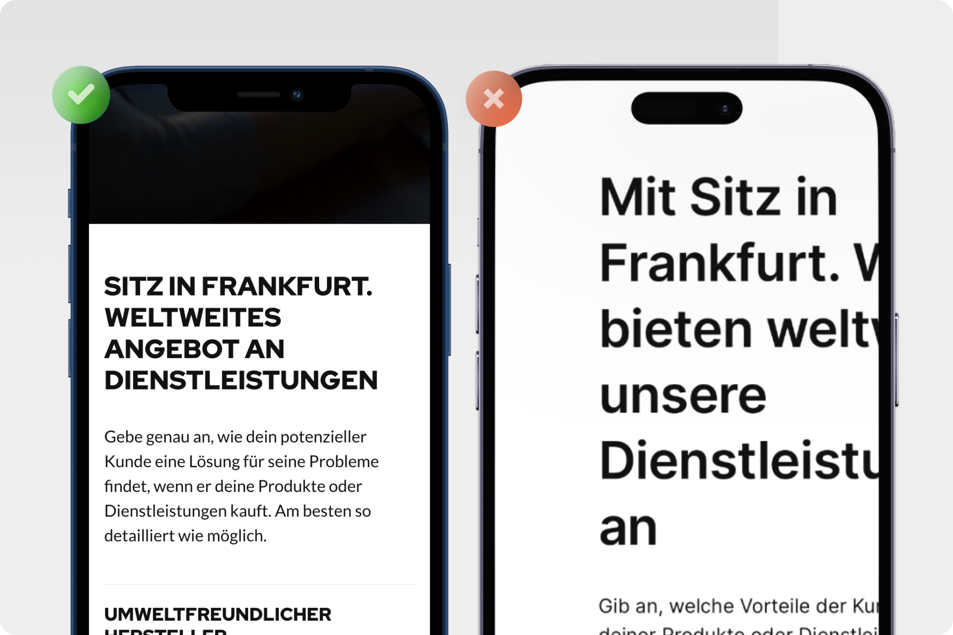
- Reduced loading times: Images and content are adjusted to load faster on mobile devices.
- Simplified Navigation: Menus and navigation are often streamlined to facilitate user guidance on smaller screens.
- Touchscreen optimization: Elements like buttons and links are enlarged to ease interaction on touchscreens.
- Less content: Not all content from the desktop version is displayed on the mobile optimized version to maintain clarity.
Responsive design:
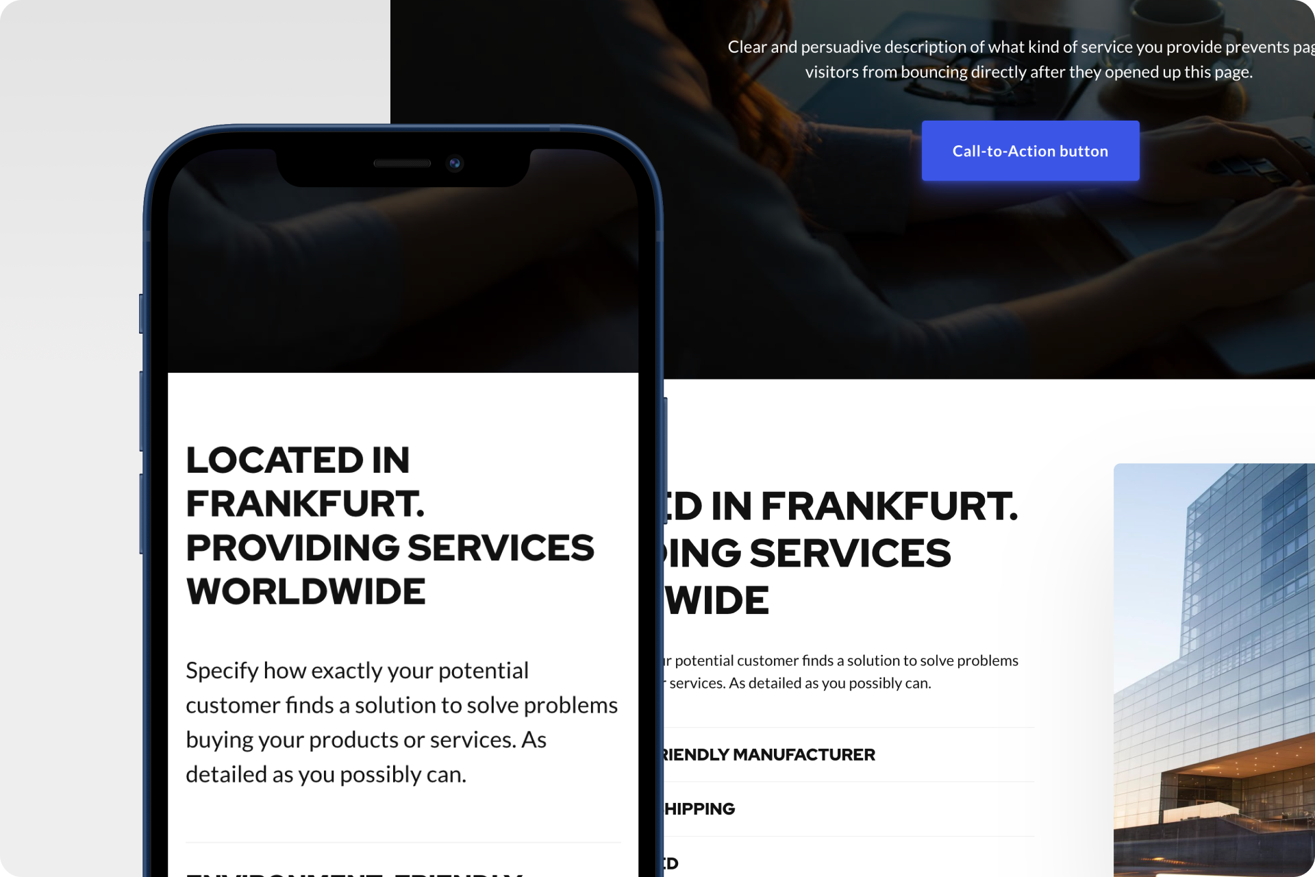
Responsive design pertains to a design technique where your website is developed to automatically adapt to various screen sizes and devices. Instead of creating separate versions for different device types, the website's layout dynamically adjusts to the screen size it's being viewed on. This approach ensures a consistent user experience whether the website is viewed on a desktop computer, tablet, or smartphone.
Characteristics of responsive design:
- Fluid adaptation: The website seamlessly adjusts to various screen sizes.
- Consistent layout: The layout remains consistent across all devices, though elements can be rearranged for enhanced user-friendliness.
- No additional versions: Only one version of the website is necessary, simplifying maintenance and updates.
- Full content: The entire content from the desktop version can also be displayed on mobile devices without compromising the user experience.
The crucial distinction:
The pivotal distinction lies in the approach. While a mobile optimized website constitutes a specialized version for mobile devices, responsive design aims to create a single adaptable website that functions optimally on all devices.
Opting for a mobile optimized website could involve creating an exclusive mobile version of your website, tailored specifically for smaller screens. This can be particularly valuable if you want to emphasize specific content or features on mobile devices.
On the other hand, responsive design offers a consistent user experience across devices by adjusting the layout and elements to look and perform optimally on any screen.
How to make your website mobile-friendly: Proven steps and practices
Here, we provide you with tried-and-true steps and practices to ensure your website is mobile-friendly, delivering an exceptional user experience:
- Utilize responsive design:Responsive web design is the cornerstone to crafting a uniform and user-friendly website across all devices. Your website seamlessly adapts to various screen sizes, ensuring an optimal display. The advantages of responsive design encompass a consistent appearance, streamlined maintenance, and optimized SEO performance.
- Benefits of responsive design: A responsive layout guarantees a consistent experience, irrespective of the device in use.
- Adaptable layout: Dynamically adjusting elements facilitate optimal content visibility on differing screen sizes.
- Conduct mobile testing:Employ tools like Google's "Mobile-Friendly Test" to assess how well your website performs on mobile devices. This tool offers insights into potential issues and avenues for optimization.
- Exploring Further Testing Options: Consider utilizing alternative testing tools to gain a comprehensive analysis of your website's mobile-friendliness.
- Optimize loading times:Swift loading times are pivotal for mobile devices. Enhance your website's performance by reducing image file sizes, minimizing redundant code, and employing caching techniques.
- Image compression: Optimize images to achieve quicker loading times.
- Code minimization: Eliminate unnecessary code to heighten website speed.
- Prioritize touchscreen user-friendliness:Ensure all elements on your website are seamlessly navigable via touchscreens. Steer clear of overly petite buttons and ensure intuitive navigation.
- Intuitive navigation: Seamlessly integrate user-friendly touchscreen navigation.
- Button dimensions: Implement proper sizing of buttons and links.
- Customize content for mobile users:Tailor your website's content to cater to mobile users. Divide lengthy text sections into smaller paragraphs and incorporate lists to enhance readability on compact screens.
- Brief paragraphs: Employ concise paragraphs to ease reading on mobile devices.
- Lists and bullets: Lists and bullet points facilitate a smoother reading experience.
- Don't overlook mobile SEO:Ensure your mobile version boasts high-quality content and pertinent keywords, paralleling your desktop counterpart. This effort contributes to securing favorable placements within search results.
- SEO optimization for mobile design: Seamlessly integrate keywords into your mobile version.
- Mitigating duplicate content: Prevent the potential issues arising from duplicate content between desktop and mobile versions.
- Execute usability tests:Regularly perform tests across varied mobile devices to ensure flawless functionality and provide users with a favorable experience.
- Testing process: Implementing usability tests.
- User feedback: Gather feedback from actual users to foster continual enhancement of your website.
By adhering to these steps and ensuring your website is mobile-friendly, you can deliver an exceptional user experience on every device and ensure your website is equipped to tackle future digital challenges.
Common mistakes and how to avoid them
Despite a clear understanding of the significance of a mobile-optimized website, there are common pitfalls that one can easily stumble into. Avoiding these pitfalls is crucial to ensure your website functions seamlessly on mobile devices and captivates users:
- Untested display:Different devices, screen sizes, and browsers can lead to unexpected display issues. Thus, it's essential to test your website across a variety of devices and screen sizes to ensure all content displays correctly.
- Slow loading times:Lingering loading times are particularly frustrating on mobile devices and can drive visitors away in frustration. Optimize loading times by reducing image sizes, refining code, and employing caching techniques to ensure your website loads lightning fast.
- Unoptimized images:Large, unoptimized images can drastically slow down loading times and impact the mobile experience. Use image compression tools to reduce the file size of your images without sacrificing visual quality. This way, visitors can enjoy faster loading times without compromising visual appeal.
- Cluttered navigation:Unclear or overloaded navigation can frustrate visitors and deter them from engaging with your website. Ensure your menus are well-structured and intuitively comprehensible, allowing users to navigate to desired content effortlessly.
- Not adapted for touchscreens:Tiny buttons and links hard to tap on touchscreens can significantly hinder the user experience. Ensure all interactive elements are adequately sized for comfortable finger tapping, facilitating smooth interaction.
- Hidden content:Content that remains concealed or inaccessible on mobile devices leads to an incomplete user experience. Ensure all vital content, whether text, images, or functionality, is visible and reachable on all devices, ensuring users can enjoy your website's full spectrum.
By identifying and purposefully evading these common pitfalls, you lay the foundation for a successful mobile-optimized website that impresses users, convinces search engines, and delivers positive experiences on every device.
Effortlessly create a mobile-optimized site with Onepage.io
Creating a mobile-optimized website might sound like a daunting task, but with the right tools and resources, the process can be surprisingly seamless. One such tool that can assist you in building an impressive and mobile-friendly website is Onepage.io.
What is Onepage.io?
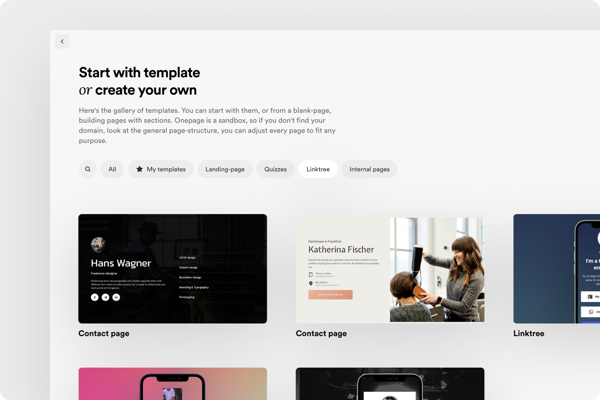
Onepage is a website builder that allows you to create landing pages, websites, funnels, and quizzes with just a few clicks. All within a single tool.
Onepage focuses on productivity and aesthetic UX design. With hotkeys, command lines, and remarkable software performance, you can construct high-quality and mobile-optimized pages.
Onepage has an advantage over other page builders in that the sections you create for your landing page are inherently mobile-optimized. This means your site automatically adapts to mobile devices. Our designers have already taken care of this aspect for you!
Furthermore, you can customize each section to meet your individual needs. For instance, sections meant exclusively for mobile phones won't be visible to visitors accessing the site from a laptop. Here's a step-by-step guide on this topic.
How to Create a Mobile-Optimized Site with Onepage.io:
- Sign Up and Get Started:Visit Onepage.io and sign up. Registration is free and grants you access to the page builder.
- Choose a Template:Onepage.io already offers a variety of professionally designed templates for you to choose from. Select a template that aligns with your purpose and style. These templates are already mobile-optimized, saving you considerable effort.
- Customize Content:Tailor the pre-built content of the template to your needs. Add or edit text, images, videos, and other elements to reflect your brand identity.
- Responsive Design:All templates are already responsive, meaning they automatically adjust to various screen sizes. You need not worry about technical details, as the platform ensures your website is optimally displayed on mobile devices.
- Preview and Adjustments:Before publishing your site, use the preview function to ensure everything looks as intended. Make any necessary final adjustments to ensure an optimal mobile user experience.
- Publishing:Once satisfied with the result, you can publish your mobile-optimized website with a single click.
With Onepage.io, you can create a mobile-optimized website in no time, without the need to fret over design or development intricacies.
Practical examples of mobile-optimized websites
In today's digital landscape, having a mobile-optimized website is crucial to providing users with an optimal experience across all devices. Here are some inspiring real-world examples of companies that have successfully created mobile-optimized websites:
- Amazon: Amazon is a prime example of a mobile-optimized website. Its mobile version offers streamlined navigation, clear call-to-action buttons, and an optimized product search. With a user-friendly layout and fast-loading pages, the shopping experience on mobile devices is seamless.
- Airbnb: Airbnb has created a mobile-optimized website that makes booking accommodations on mobile devices simple and intuitive. Featuring large images, well-structured information, and a user-friendly calendar for selecting travel dates, Airbnb provides a top-notch mobile user experience.
- Starbucks: Starbucks has developed a mobile-optimized website with a focus on ordering and payment features. Users can order and pay for their favorite drinks via the mobile website before heading to the store. This seamless integration of online and offline experiences is a remarkable example of mobile design.
- H&M: H&M's website offers a clear and appealing display of its fashion collections on mobile devices. Featuring large images, user-friendly filtering options, and easy navigation, users can effortlessly browse and shop through product offerings.
- The New York Times: The New York Times website has been optimized for mobile users, presenting content in an organized and easily readable manner. Articles are well-structured, font sizes are adjustable, and navigation is facilitated through clear menus, making news consumption on mobile devices enjoyable.
- Uber: Uber provides a mobile-optimized website that allows users to easily book rides and select vehicle options. The clear display of available vehicles and prices, coupled with a user-friendly booking interface, makes the website mobile-friendly.
These examples illustrate how companies can create an optimal user experience on mobile devices through targeted adjustments and optimizations. Regardless of the industry, ensuring your website functions seamlessly on all devices is paramount to attracting and retaining users.
Conclusion
In the ever-evolving digital world, having a mobile-optimized website is no longer an optional add-on, but a fundamental aspect of a successful online presence. The increasing use of mobile devices and the mobile-focused approach of search engines like Google have changed the rules of the game.
In this article, we've highlighted the essential importance of a mobile-optimized website and detailed how you can ensure that your website performs at its best on every screen. From the differences between mobile-optimized websites and responsive design to the principles of successful mobile optimization, we've provided a comprehensive insight.
Ready for the next step? Create your mobile-optimized website now with Onepage.io!
Take the decisive step and sign up for Onepage.io today. With professional templates, responsive design, and an intuitive user interface, you have everything you need to bring your vision to life. Realize your mobile-optimized website with ease! Simply follow the link to sign up and maybe even publish your first mobile-optimized website today!
Start with
Onepage for free.
It’s fast and enjoyable
Onepage is free to use. It’s not a trial version.
No credit card is required


