February 11, 2022
What really matters in a landing page for businesses (and what doesn't)
Learn what really matters in a landing page for businesses (and what doesn't)

What really matters in a landing page for businesses (and what doesn't)
The landing page - one of the essential tools in online marketing. Many myths exist around landing pages, and today we're going to talk about how to distinguish the important from the unimportant
There are already over 6,000 people who have created landing pages using our Onepage software. In practice, we see time and again that some pages work better than others. But what makes a good page? Does a bright and great design, a well-written text, or a well thought out page structure help?
Put it all together.
You can find a lot of articles on the internet about how to create landing pages. However, in most cases, only one question is relevant: Is there anything you have to pay special attention to in the design, the texts, and the structure?
Yes.
Creating a good landing page is easier than you might think. We've put together a collection of tips for those who already have experience creating such pages and want to dig deeper.
Get more leads, better conversion rates, or improve the design of your pages.
But this topic is also useful for newcomers.
What is a landing page?
On Wikipedia, you can find the following definition for the term landing page: It is a page whose main purpose is to generate leads. However, this is not entirely correct.
As the name "landing page" implies, it is a page whose main function is to collect and process traffic that comes from various sources: Advertising, social media, email lists. As a result, a landing page is used to collect contact information or directly initiate sales.
So the nature of a landing page depends on the context. Some landing pages may not sell directly but are more of a referral layer to pass traffic through.
However, all types of landing pages share a common concept: They must serve a clear, defined purpose while achieving the highest conversion rate possible.
A conversion might be a request to view a house if you're in real estate, a reservation for a table at a restaurant, or a direct online payment for a product, such as an e-book, for which you've connected a payment system.
Now that we know how landing pages work, it's logical that a company's main task after creating one is to improve the performance of the page.
Improving the conversion rate.
You need to know that most of the articles available on the internet about improving conversion on a landing page are not applicable to real businesses for the following reasons:
- You neither have a large team nor time to waste. The resources to, for example, conduct a detailed audience analysis, create a meaningful USP and a high-quality page design are often not available if you're working alone or with only a small team.
- You need a large data set, such as large-scale A/B testing, where you need to collect thousands or even tens of thousands of leads to draw conclusions about whether or not your hypotheses worked. Small businesses simply don't have those kinds of resources.
In this article, we've put together a set of guidelines for creating and optimizing a landing page that are sure to work and have already been tested for you. And most importantly: You can easily put our tips into practice yourself.
(As well as what we don't think has any bearing on it, but you can still find this information in a thousand other guides on the internet).
Tip: This article is not about how to create a landing page from scratch. You can find that information in our detailed landing page crash course on Onepage.io. With the link to the Onepage Business package, you will automatically get access to the course
What makes our experience so unique is the perspective of a team that has created hundreds of their own landing pages and watches tens of thousands of our clients' pages every day.
Let's get started.
Find the target audience for your page
(what will get them interested in scrolling further)
There's no magic formula for finding and analyzing the right target audience.
Ask your customers.
Yes, just pick the customers who paid you the most and were the most pleasant to work with.
Then check out their Facebook/ LinkedIn or Instagram profiles to see what they look like, what they write, and what content they subscribe to. I'm sure you'll find they have a lot in common. Enough to get a feel for what kind of people they are.
Ask them.
To create an effective landing page or improve an existing one, you just need to answer two questions:
- What do these people look like, what do they have in common?
- Why did they buy, or will they continue to buy from you?
If you're just starting out and don't have any customers yet, you can search for reviews of your competitors on specialized websites that work just as well.
Convert your customers' responses into copy that is compelling to them
(to encourage the sale instead of making it more difficult).
For example, if we know that at Onepage, one category of customers are small advertising agencies, we show the features they are interested in on our main landing page, using the appropriate professional slang as well.
This way, people in the industry notice that we speak the same language as them. This leads them to want to learn more about the product.
Example #1.
For example, if you're a notary public (or creating a landing page for a notary public), you would structure the page and write copy the way the audience interested in notary services would expect it.
To make a decision, prospects will likely need the following information:
- Where are you located?
- What experience, education, and certification do you have?
- In what areas of law do you practice?
- How quickly are you available?
- How can I contact you?
This landing page was created by one of our great Onepage clients.
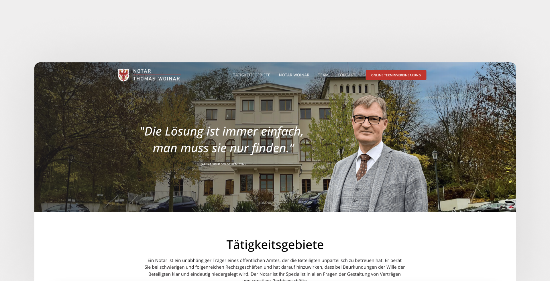
We especially like the quote in the first paragraph - It would look odd on a landing page for a fitness instructor, but it's totally appropriate for a notary public who is considered a reliable and educated person.
Example #2.
If you are selling machinery, usually the engineer or manager in charge will make the first contact with you. Of course, the text here should also be adapted to the mindset of this target audience.
Let's take a look at an example of an office air conditioning system that was implemented this way by one of our customers.
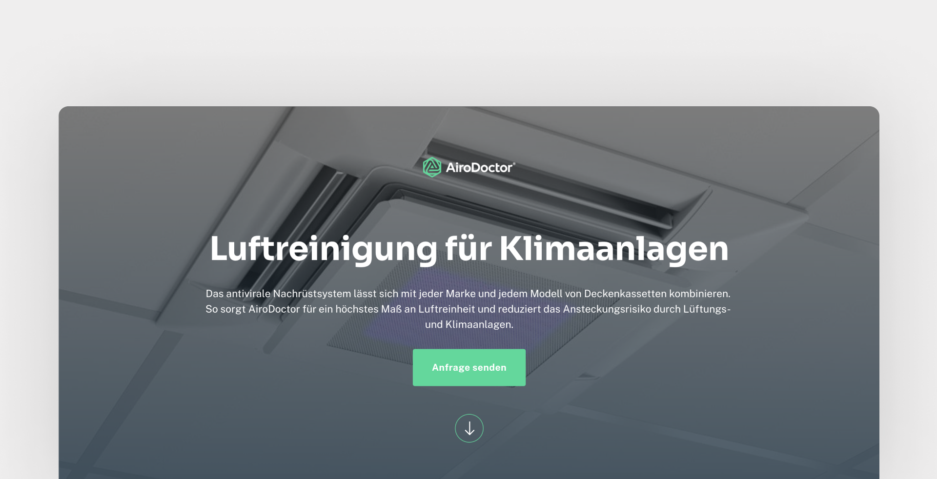
To make a decision, prospects will likely need the following information:
- Presence of the required certificates and evidence of effectiveness.
- Benefits that justify replacing old equipment with new in the long term (offices already have air conditioners, right?)
- Even more benefits
- Social proof in the form of testimonials that someone has already used the device and is happy with it
An important criterion are the used technical terms, certificates, and details, which are definitely important for the audience of this site when making a purchase decision. Excellent!
Example #3.
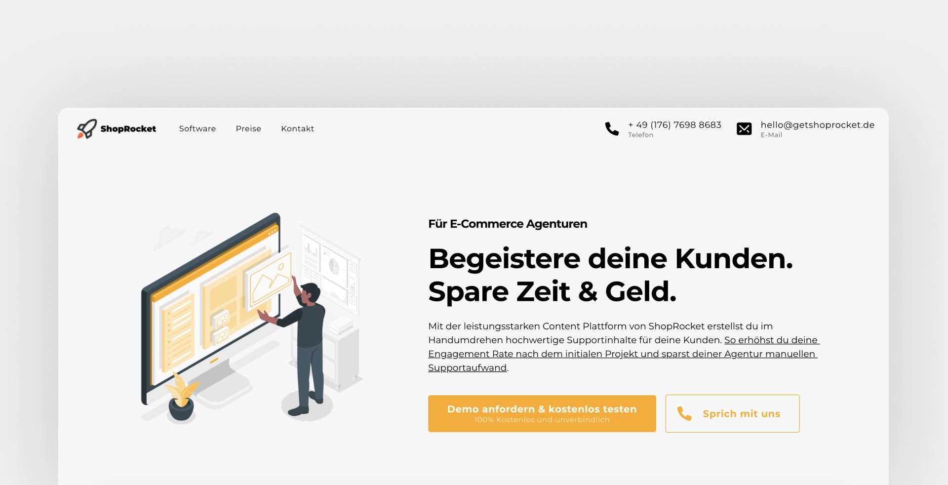
And an extraordinary example shows how the online agency "Fastlane Marketing" approached the creation of a premium landing page for their clients. There they accompanied their customers for 12 weeks.
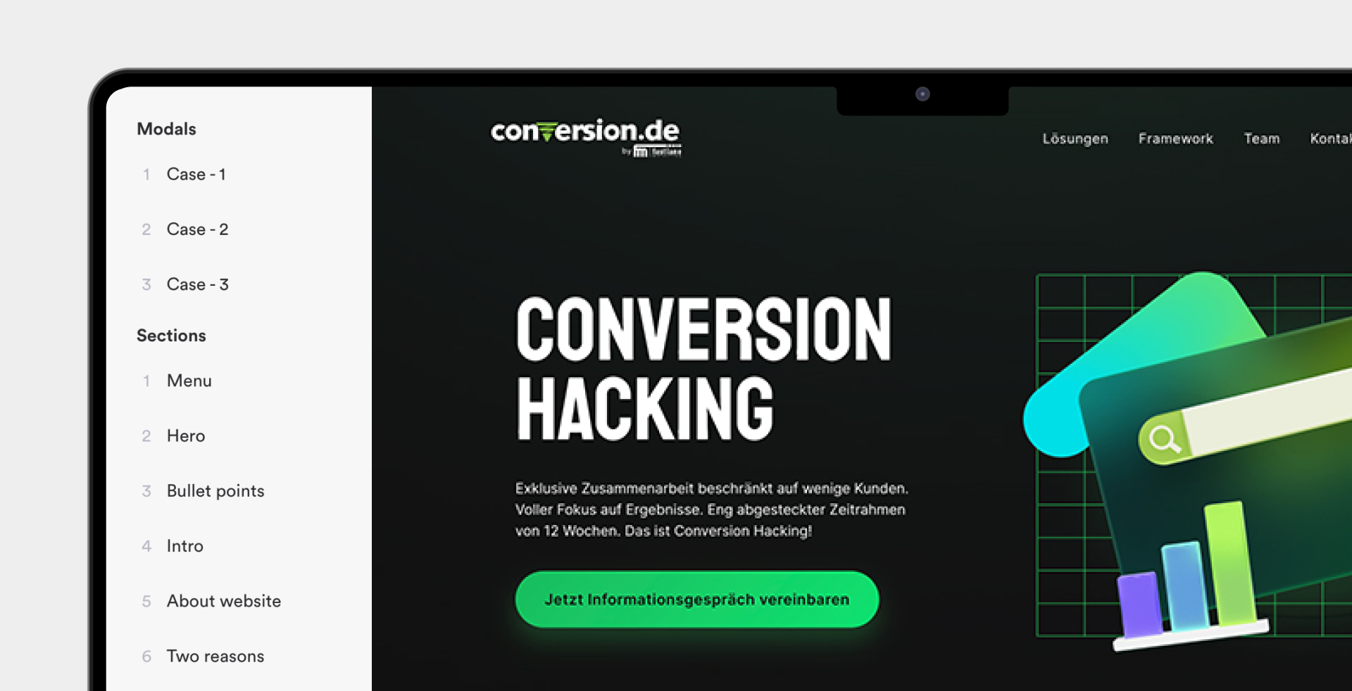
Since the conversion.de program is aimed at companies that have already taken their first steps in online marketing and now want to improve their results, it was important for them to include the following things on their page:
- A detailed description of the workflow within the program
- Testimonials that prove the agency can guarantee results within 12 weeks
- A sense that the agency understands the concerns and needs of their target audience
Our clients have done an excellent job in creating conversion.de.
What we can take away from the first part is that in order to create or improve a landing page, it is important to understand your target audience. You have to formulate a text with appropriate information that is relevant to the buying decision.
You can remember the following simple rule: Simplify for a broad audience and add details for a narrower and more professional audience.
Divide your texts into meaningful sections and arrange them in the right order
(do this according to our advice)
Pay attention to only two aspects of the sections on your page: the optimal page length and the order of your sections. There are simple rules for both, which we will discuss in a moment.
The order of the blocks
Most landing pages use standardized blocks that Onepage is built on. A block is a necessary small component that should make up your page.
According to the principle: one block = one message you want to convey
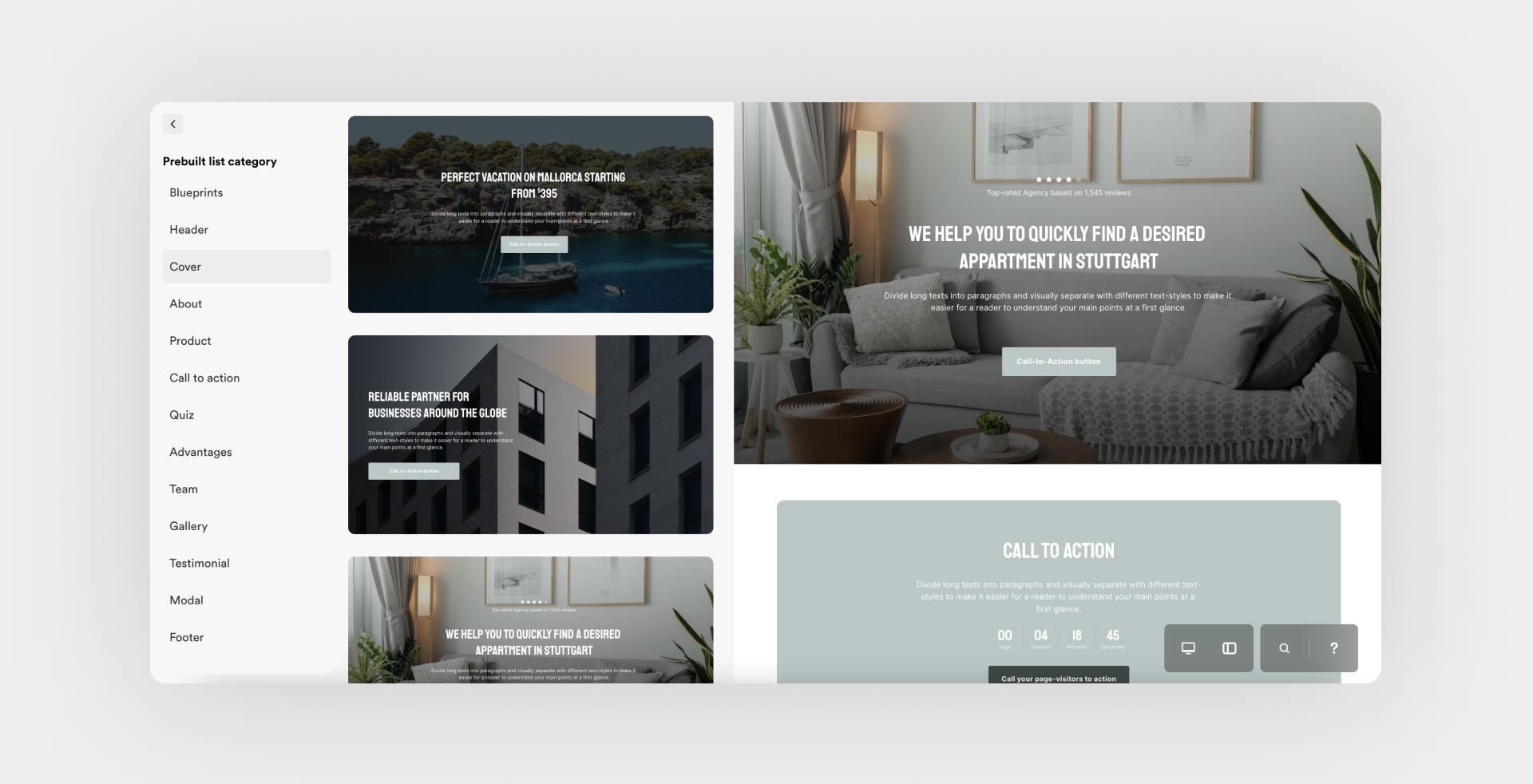
Below we will go over the classic blocks and their position on a landing page. Here they are:
It's not a universal rule, but if you follow our advice, it will definitely work for your business.
- Hero Section
- "About Us" section.
- Block with calls to action
- Block with listed benefits
- Block with testimonials
- Block with a description of the product or service
Since we are already familiar with copywriting principles, choose blocks based on whether they are important to your product or service (and your audience) and present them as the situation requires.
Example #1.
If you're selling physical goods, like dropshipping on Amazon, then the mandatory blocks are:
- A title with a good photo of your product and an appropriate description
- Benefits, with unique product features
- Testimonials, with reviews from people who have already bought your product
- Specifications, with additional information about the product
You probably won't need an extra block with the introduction of your team or a brief description of your company, as in this case, this is not the key for a site visitor to make a purchase decision or fill out a form.
Example #2.
If you are in the software industry and have developed an IT product, then you most likely need:
- A title with an illustration or screenshot of your software.
- Benefits and functionalities
- Pricing plans with monthly, annual, or one-time subscription fees
- Call-to-action with an entry form for a demo or registration.
Be sure to start with the title page. The header and design are responsible for getting the visitor to "stick" on the page and keep scrolling. In fact, it's so important that in our landing page crash course, we dedicated a separate video just to creating a hero section.
Optimal page length
When choosing a page length, we make sure it's sufficient for conversion, which usually means it depends on the story you want to tell with your text.
To make the decision easier, we recommend you to keep the following in mind: In general, keep the page longer the more "difficult" actions you require from the user.
Explanation based on an example of a web application
If an IT company (from the example above) wanted visitors to have to sign up for a free call instead of signing up directly before they could test the application, that page would have to be extended several times.
The whole story that the landing page tells us would have to be much more compelling and consequently longer for a visitor to make the decision to talk to a personal contact first.
This is not true for big and well-known brands, but it is very true for SMEs, which are not yet very well known.
Example #1.
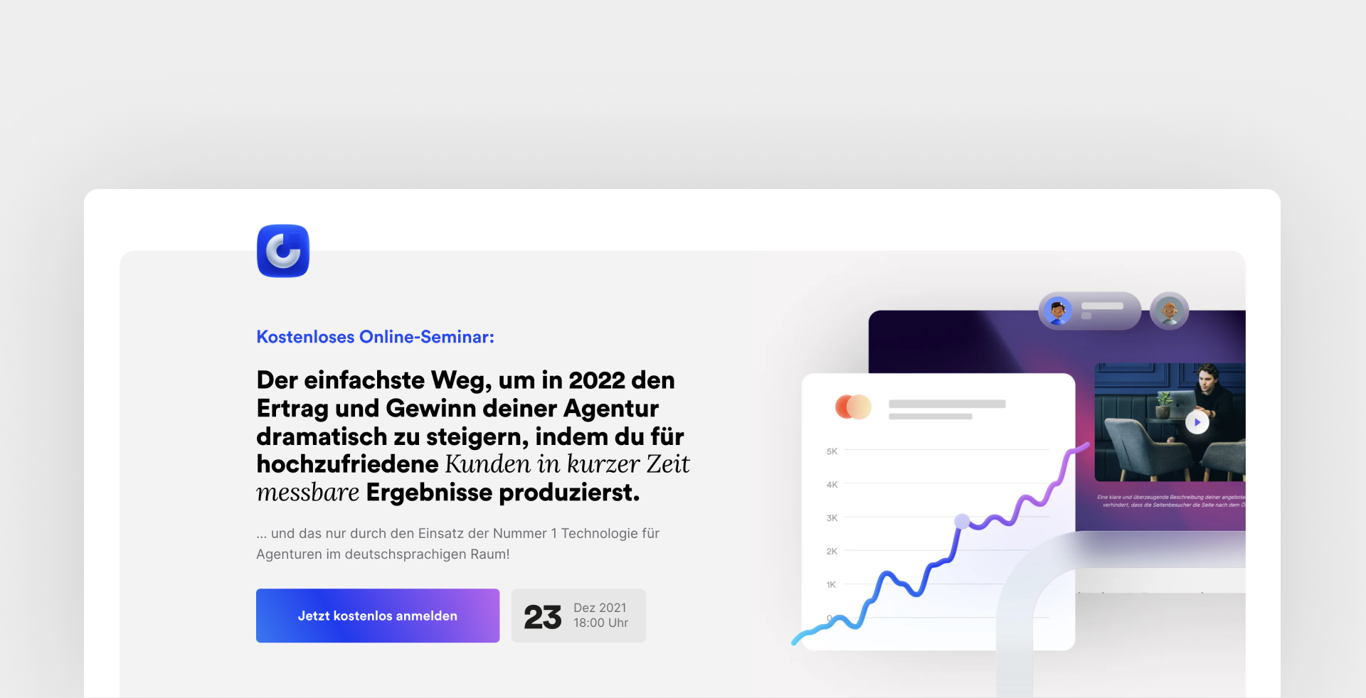
For example, here is the page of our webinar that we hosted in 2021. In order for a visitor to leave us their name and email address in exchange for free participation, we were able to fit all the necessary information into just three paragraphs.
The page is short and works perfectly
Example #2.
And here is the first page of a funnel from a classic (but very talented) American marketer. He is already asking for online payment of $23 for a hardcover book from his site visitors in advance.
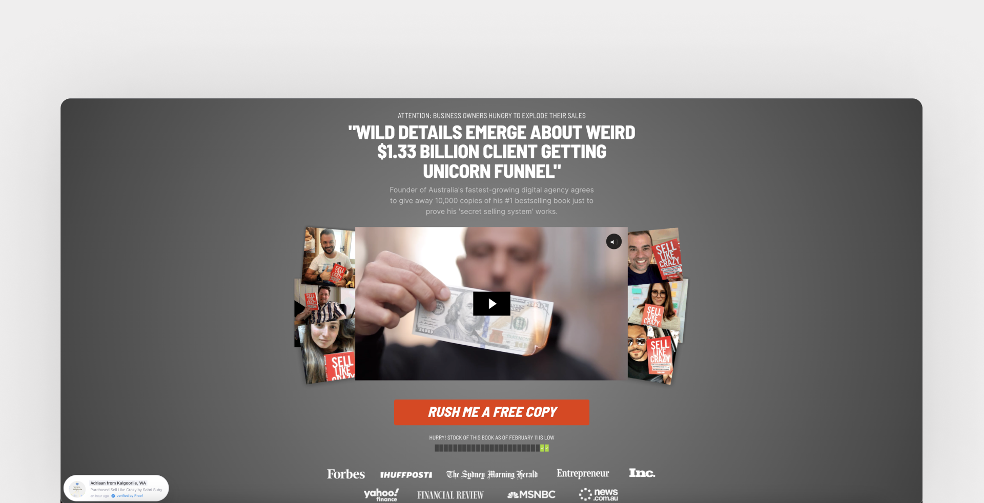
The page is outrageously long, but we assume it's optimized for the highest possible conversion to buy this book.
Keep your page design simple. Then improve it.
Finally, we come to design. This aspect of page creation usually gets the most attention. However, unfortunately, it often doesn't dramatically improve the performance of your landing page.
When we talk about design, we talk about colors, fonts, pretty images, and graphics.
We, the Onepage team, have a passion for design. We have designers with more than 15 years of experience working for us, and some components of our software were developed over months, but we are also realists.
It is advisable to accept the simple realization that a very appealing design will only lead to sales if a large team works hard on it. Most companies and agencies only worsen their conversion rates by using too many design tricks on their site.
What specifically is irrelevant in the design of your page for conversion:
- Animations and effects like parallax
- Selecting colors of buttons appropriately for the client's "prototype."
- Using more than 2 fonts on the page
- The size of CTA buttons, if they are already clearly visible
- Color scheme and the use of gradients as well as vector illustrations
You may like an attractively designed page, but that still doesn't change the facts just mentioned.
Simple, important aspects of page design
So, the question arises. How can you make your landing page design effective and really improve your page conversion rate? So much so that it makes sense to invest your time in this topic.
Rule #1. Treat the design as if it were your text.
It may surprise you, but if you publish a very compelling text (for example, in Word on a white background) and add a few eye-catching buttons, the effect of such a page will be about the same as if you had invested a few more hours in an elaborate design.
It is enough to make sure that:
- The headline can be distinguished from the subheading and the lowercase text
- The size of the lowercase text is easily readable
- No more than 2 (maximum 3) different fonts are used
In Onepage, we have predefined the optimal font sizes for reading, so you can select them with a single click. In other software solutions, you have to choose the font size yourself.
The above tips also apply if you just want to properly format a text document in Word before sending it to your colleagues.
Rule #2. Invest in good pictures
Good, professionally taken photos have a huge impact on conversion rates. Whether you're selling products, marketing services, or running a restaurant, a good landing page just needs a compelling story, good copy, and great images.
When a visitor views your page, you build a relationship with them. The better (and more genuine) your content is, the more credible your page will be.
That leads to more conversions.
No, we're not saying that stock photos don't work at all, but high-quality and real images or videos simply work better.
From our years of experience, we are very familiar with when a client uses a set of poor quality media and then has to paint over the page with graphics to compensate.
But if you have a high-resolution photo or video, just use it. It's as simple as that, just like the examples below.
Resume
As you work to improve your landing page, focus on the most important thing: converting mere page visitors into leads.
Your conversion rate depends on these factors in addition to the type of traffic, brand awareness, and offer:
- Is the visitor's interest piqued?
- Does the content on your page resonate with your audience?
- Is your offer attractive to them?
- Will they take the action you want them to take?
You can improve your landing page by working on your page's story, structure, and design step by step, following the examples in this article. We hope you find our content useful because it is the foundation we're building Onepage on, too.
Try it out for yourself and create your first landing page with Onepage. With our software, you can create your own page easily, quickly, and most importantly, for free. Just follow the link to sign up and maybe even publish your first landing page today!
Start with
Onepage for free.
It’s fast and enjoyable
Onepage is free to use. It’s not a trial version.
No credit card is required


