May 8, 2023
Landing pages that inspire: 8 landing page examples
Discover 8 landing page examples that will inspire you
Landing pages that inspire: 8 landing page examples
In today's digital world, it is essential for companies to have an online presence and to attract potential customers to their landing page or website. But how do you turn a large number of visitors into paying customers? An effective landing page can make all the difference. Unlike a typical web page, it can take the audience on an exciting journey and captivate them with engaging content. A landing page, however, can be much more than just a simple destination page. It can impress the audience with fascinating visual elements and compelling content.
But what does a successful landing page look like and how can it be used optimally? In this article, we will look at some innovative application examples for landing pages. Whether you want to promote a webinar or introduce a new product, these landing page examples will help you achieve your marketing goals. Be inspired by these 8 creative landing page examples!
Example landing page: Coaching business
A well-designed landing page is essential for a successful coaching business. It is the digital face and the first point of contact with potential customers. A coaching landing page is the opportunity to convince potential customers of your offer and to take the first step towards a successful customer relationship.
When creating a landing page for a coaching business, it is important to put yourself in your target audience's shoes and understand their needs and problems. Show on the landing page how your coaching offer can help solve the problems of your target audience. Clearly present your offer and communicate your strengths and expertise as a coach. Use social proof elements such as customer reviews and references to gain the trust of potential customers and strengthen your credibility.
Example of a successful coaching landing page:
#1 King Of Weighted Coaching
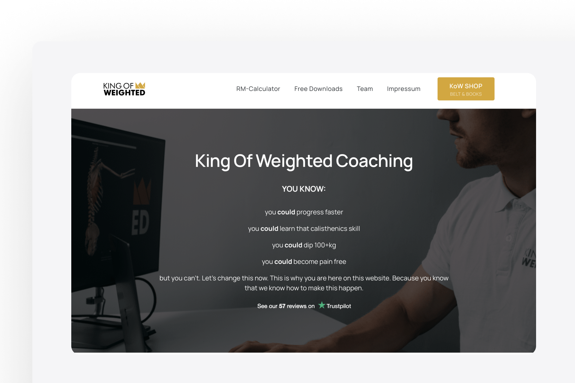
The landing page of "King of Weighted" is a great example of an effective and targeted landing page for a coaching business. The page is clearly and concisely designed, and presents Michael Schulz as a leading expert in the field of weighted calisthenics. As a three-time German champion and record holder in weighted calisthenics, Michael Schulz has built a high level of credibility and can thus convince potential customers of his expertise.
The landing page clearly presents the offer of "King of Weighted" and shows how Michael Schulz can help athletes, personal trainers, and online coaches to increase their performance and achieve their goals. The page is accompanied by customer reviews and references to gain the trust of potential customers and strengthen their credibility. Especially successful is the ability to directly schedule a free consultation call, which can encourage potential customers to contact the company directly and discuss a possible collaboration.
Landing page example: Webinar registration page
Webinars are a popular way to offer online training and events. A landing page can be used to draw attention to an upcoming webinar and encourage visitors to sign up. The landing page may include information about the webinar, the speaker, and the benefits of participating. A well-designed webinar registration page can increase the number of sign-ups and generate interest among potential participants.
To attract as many participants as possible to your webinar, you need an attractive registration page. It should be clear and concise, containing all the important information that potential participants need to register for the webinar.
Example of a successful webinar landing page:
#2 "Birth with flow"
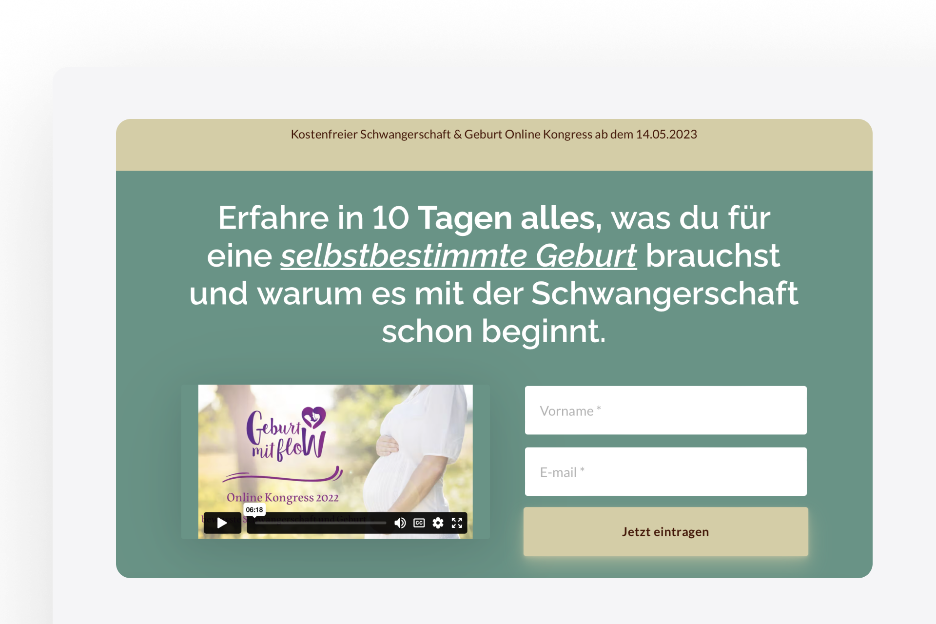
The landing page of “birth with flow” is a great example of an effective registration page for an online conference. The appealing design with appropriate images and graphics catches the attention of visitors and immediately conveys the content of the webinar. The concise wording of the content provides all the necessary information for registration.
An embedded video in the hero section generates additional emotions and trust. The experts listed on the page support the persuasiveness of the event and motivate visitors to register.
Registration for the event is straightforward and intuitive. The visitor simply enters their contact information and immediately gains access to the event. The clear call to action on the page encourages visitors to register and motivates them to participate in the event.
Birth with flow provides a good example of how to effectively promote an online conference.
Landing page example: Recruiting landing page
A recruiting landing page can be a valuable tool for finding new talent for your company and strengthening your employer branding strategy. For example, by connecting your recruiting landing page with a recruiting funnel, you can guide potential applicants through the entire application process, from initial contact to hiring.
A recruiting landing page can help increase the reach of job postings and attract qualified applicants. With the right design and targeting towards the audience, the landing page can help improve the quantity and quality of applications, ultimately contributing to the success of the company in the long term.
Example of a Successful Recruiting Landing Page
#3 Recruiting Landing Page for Tax Professionals
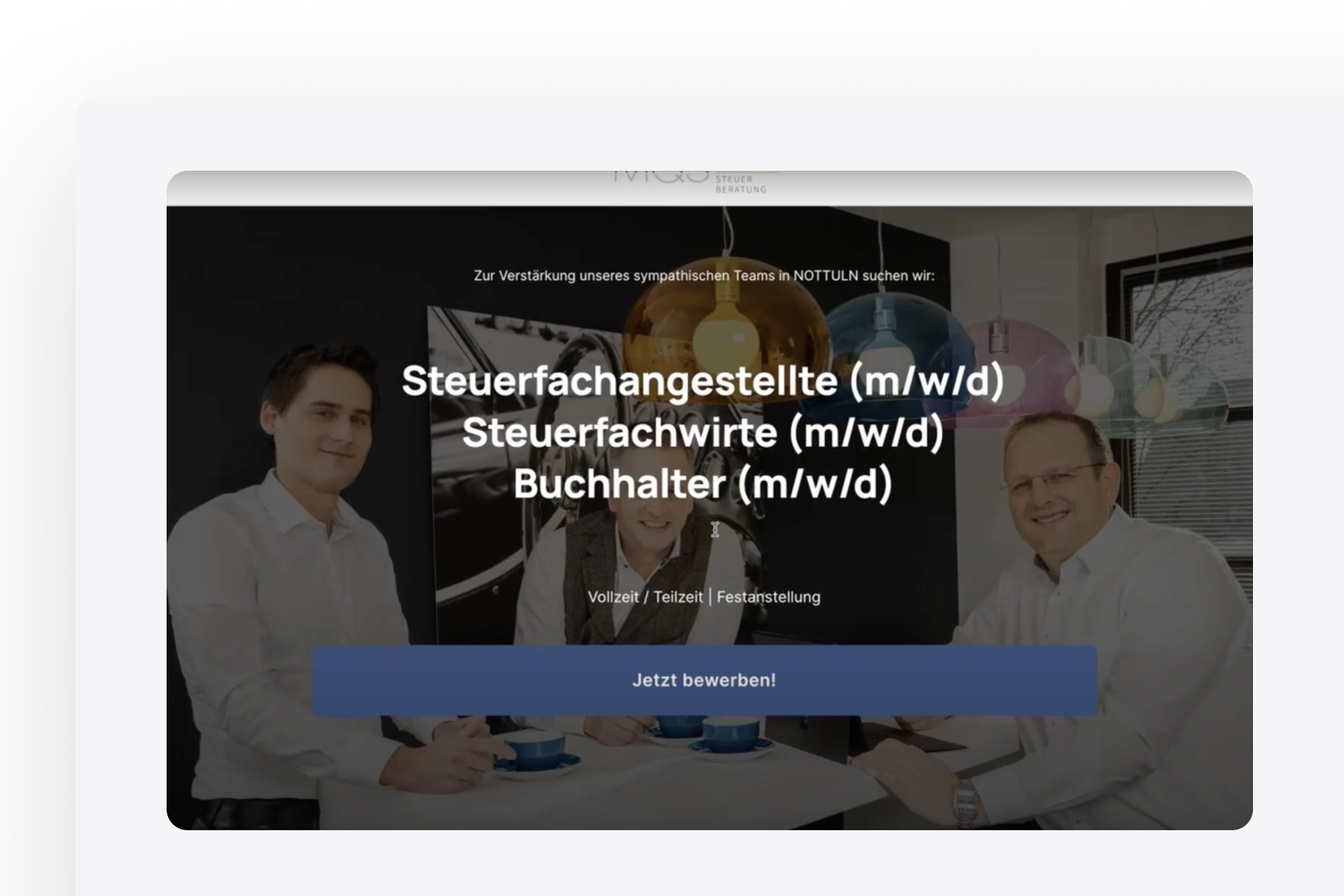
Recruiting for tax professionals can be challenging due to the high demand for highly qualified candidates and requires a specific strategy. A recruiting landing page can help reach and convince potential candidates.
Noah Schmuck from Schmuck Recruiting provides an excellent example of a successful recruiting landing page. In a Onepage interview on YouTube, he showcases a real-life client case study. Noah's advice is, "At the end of the day, people work for people. Therefore, employers should not be afraid of visibility and should show their rough edges."
The language used, images, and claims are all targeted towards the intended audience, and the CTA buttons motivate potential candidates to apply. Check out the full interview now to learn more expert tips and examples from Noah on how to implement a recruiting landing page for tax professionals: https://www.youtube.com/watch?v=baVfRdXRRPo
Landing page example: Employer branding landing page
An Employer Branding Landingpage is a crucial component of a successful recruitment strategy. It showcases the employer brand and presents the company as an attractive employer, aiming to convince potential candidates to apply for open positions within the company. A well-designed Employer Branding Landingpage can help generate interest from potential candidates, increase brand awareness, and ultimately attract talented candidates.
To be effective, an Employer Branding Landingpage should clearly communicate the company's position as an employer. This includes aspects such as the company culture, work environment, and benefits to convince potential candidates. Social proof elements, such as employee testimonials, success stories, and awards, can strengthen the trust of potential candidates and increase the company's credibility as an employer.
Example of a successful landing page for employer branding:
#4 Employer-Branding-Landingpage in event management
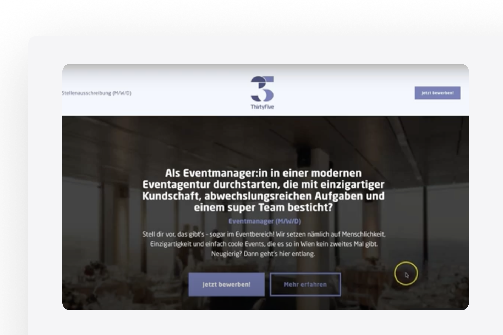
The employer branding landing page that Riffbird created for a client in event management is a successful example of how to attract job seekers with the right information. You also have the opportunity to learn all the details and steps in our YouTube interview with Bernd Leitsoni from Riffbird. Follow the link and watch the video, "Filled job position in 48 Hours with employer branding - Interview with Bernd Leitsoni."
The goal of an employer branding landing page is to create a positive employer brand and present it through meaningful content, images, and videos. The website should give job seekers insight into the company so they can envision what it would be like to work there.
Landing page example: Local business
A landing page is also a valuable marketing tool for local businesses, particularly for promoting special offers, contests, or other actions to attract and retain customers. It can also be used to promote a new store or opening and make potential customers aware of the various services and offerings of the business. A well-designed landing page can generate interest from potential customers, hold their attention, and ultimately convert them into paying customers.
Example of a successful landing page for a local business:
#5 Wintermayr electrical engineering
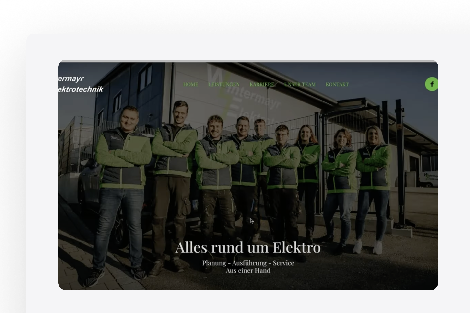
The landing page of Wintermayr Electrical Engineering, as shown by Sebastian Domes in the interview, is an excellent example of a modern and appealing landing page for a local business. Sebastian explains how he designed the page to stand out from other craft businesses and create a professional online presence. He emphasizes the importance of a modern web presence for craft businesses and demonstrates how to overcome challenges in creating a craftsman website.
The page uses clear and attractive images to showcase the craft and working methods of Wintermayr Electrical Engineering. The team members' photos are also displayed on the page to build trust and credibility. The landing page is user-friendly and provides potential customers with clear information about the company's services and an easy way to contact them.
Landing page example: Agency landing page
An agency landing page aims to convince potential clients of the services and expertise offered by an agency.
What should be considered? The landing page should be modern and visually appealing to gain the visitors' trust. It is important that the different services are presented in a clear and concise manner to convey professionalism and reliability. By showcasing satisfied customer references, the quality of work can be demonstrated and potential customers' trust can be strengthened. Additionally, the landing page should clearly communicate the unique selling points that the agency offers to convincingly demonstrate the benefits of a collaboration and persuade interested parties of the added value.
Example of a successful landing page for an agency:
#6 Ryfisch Marketing
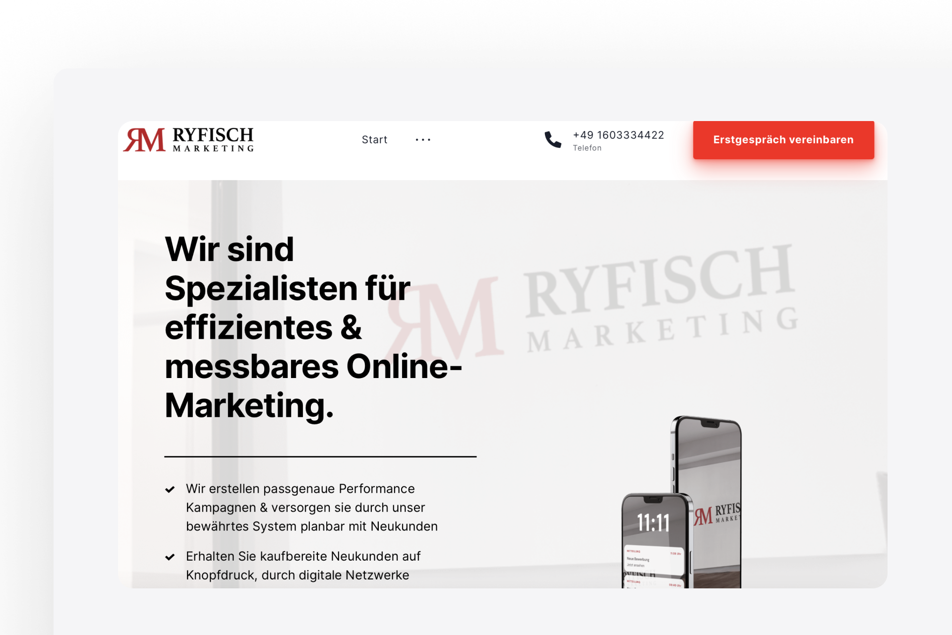
Raoul Ryfisch's landing page is a successful example of a convincing agency presentation.
The page features a modern and attractive design that conveys professionalism and competence, building trust among visitors. The various services are presented in clear sections, with references from satisfied customers underscoring the quality of the work.
Overall, Ryfisch Marketing's landing page demonstrates in a convincing manner how an agency can present its services and expertise in an appealing and professional manner on a landing page.
Example landing page: Landing page for a lawyer
A landing page for a lawyer can be helpful in various cases, for instance, if a lawyer specializes in a particular area of law and wishes to target clients who require legal support in that area. A landing page can also be useful if a lawyer offers services online and aims to reach potential customers through the internet.
A well-designed landing page for a lawyer should focus on the area of law in which the lawyer specializes. It should be clear and concise about the type of legal problems the lawyer can solve and the services they offer. Relevant information such as the lawyer's experience, education, and qualifications should also be presented.
In addition to an appealing design and clear structure, a user-friendly navigation on the landing page is important. Potential customers should be able to easily find all relevant information and have the option to directly contact the lawyer.
Example of a successful landing page for a lawyer:
#7 Guido Lenné - Attorney at law
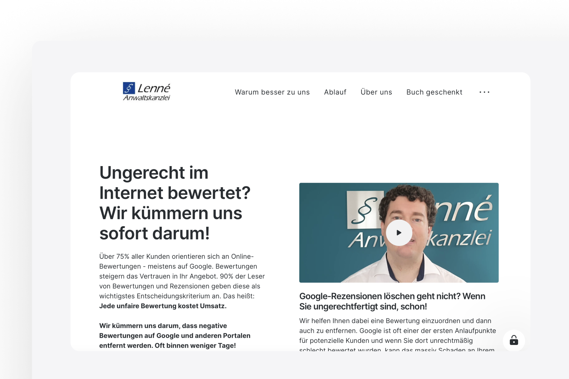
A great example of a lawyer's landing page is demonstrated by Guido Lenné. With clear and concise language, he outlines the type of legal problems he can solve for his clients. The navigation on the landing page is simple and organized, allowing potential customers to quickly find all relevant information. Additionally, all lawyers are listed to provide transparency and build trust.
Another plus is that the process of legal consultation is described in detail to inform potential clients about the process. In addition to the clear focus on the specialized area of law, the user-friendly contact option on the landing page is noteworthy. Potential clients can directly contact the lawyer and schedule a free initial consultation to discuss their case.
Landing page example: Landing page for customer acquisition
A landing page for customer acquisition is a critical tool to convince potential customers of your offer and turn them into paying customers.
When creating a landing page for customer acquisition, there are a few important things to consider in order to achieve the best possible results. You should know your target audience well and understand their needs and challenges. This will help you create appealing content tailored to their specific needs.
Another important factor is incorporating a strong call-to-action. You should clearly communicate what the next step is for the visitor to your landing page and provide them with a clear incentive to take that step. This can be a free eBook, a discount offer, or a free consultation, for example.
Example of a successful landing page for customer acquisition:
#8 Deal Academy
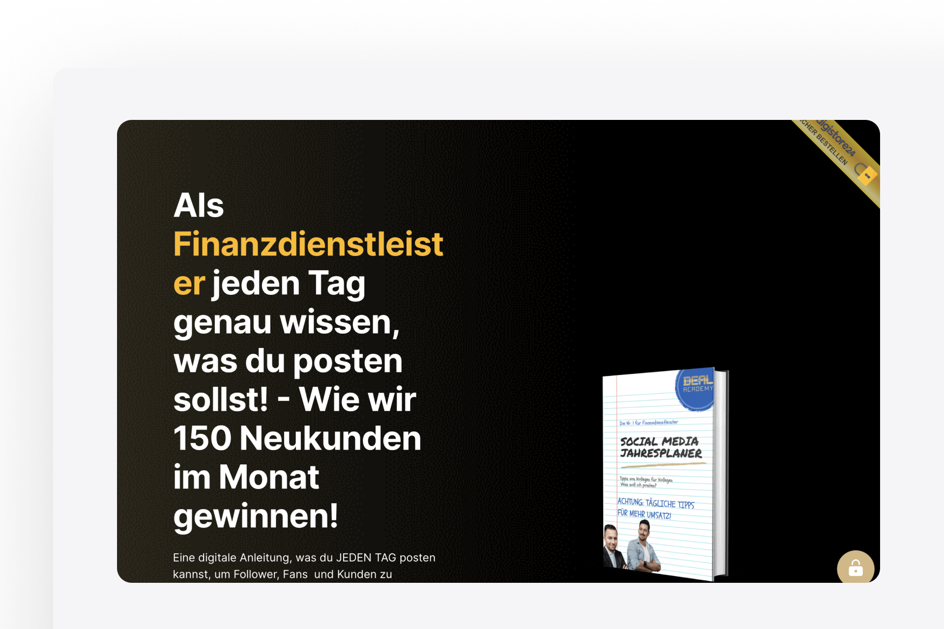
The Deal Academy is a great example of a successful landing page for customer acquisition. With a focus on financial services, the agency has developed a free digital social media planner for their target audience, which they offer on their landing page.
By providing the free digital social media planner, the agency not only provides added value to their potential customers but also demonstrates their expertise in the financial services industry. Additionally, the landing page impresses not only with an appealing design and clear presentation of the offer but also with a strong call-to-action that encourages visitors to order the planner. The Deal Academy has shown how a successful landing page can look to acquire new customers and position itself as an expert in a specific field.
Conclusion
We hope that with this article we were able to present you 8 examples of different landing pages. Each example was created with Onepage.io and showcases a different design and business model. You can use these examples as a reference and create or optimize your own landing page based on them.
Try it out for yourself and create your first landing page with Onepage. With our software, you can easily, quickly, and most importantly, for free, create your own landing page. Simply follow the link to sign up and maybe even publish your first landing page today!
Start with
Onepage for free.
It’s fast and enjoyable
Onepage is free to use. It’s not a trial version.
No credit card is required

