July 3, 2023
Create your website: A guide to achieving successful website design
Create an impressive website design with this guide
Create your website: A guide to achieving successful website design
First impressions can often make all the difference. In today's digital era, where the internet serves as our gateway to the world, a well-designed website or landing page is of immense importance. It serves as your online business card and can determine whether visitors stay on your site and make use of your offerings or get lost in the virtual space. Engaging website and landing page design can pique interest, build trust, and ultimately convert visitors into customers.
However, the challenge lies in developing a design that is not only visually appealing but also provides a seamless and intuitively understandable user experience. It's about finding the right balance between appealing aesthetics and functional user-friendliness. But don't worry, because today we will provide you with valuable tips from the perspective of a UX expert to take your website and landing page design to a new level.
Whether you own a business and offer products or services online, run a blog, or simply want to build a personal online presence, these tips will help you unleash the full potential of your website or landing page. Ready to dive into the world of successful website design? Let's get started!
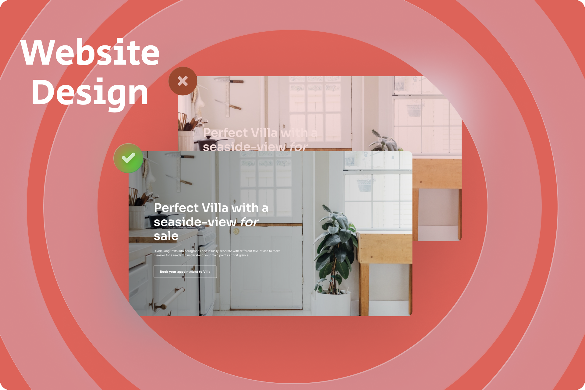
#Clear and simple design
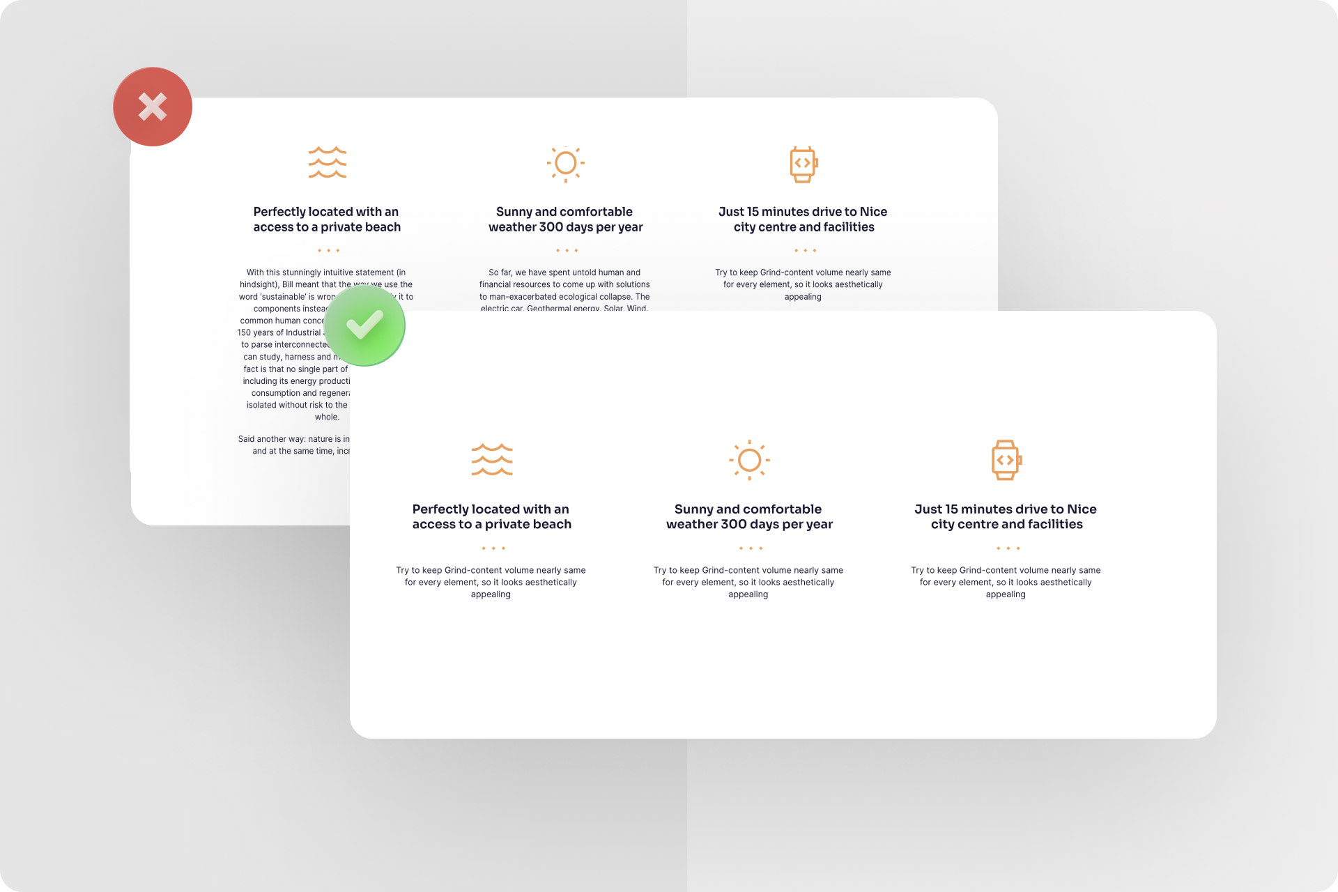
A good website design is characterized by clarity and simplicity. Avoid cluttered pages that may overwhelm visitors. Keep the design clean and organized, making the most important information easily recognizable. Utilize a clear structure and provide intuitive navigation, allowing visitors to navigate your website effortlessly.
Do's:
- Use clear and concise headings to draw visitors' attention to important information.
- Utilize ample white space to relieve the design and enhance content visibility.
Don'ts:
- Avoid overcrowding your pages with excessive information, images, or elements that may distract attention.
- Avoid complex navigation structures or hidden menus that make it difficult for visitors to find the desired information.
How to apply it in practice
Let's imagine you want to create a website for your new café. You desire a clear and simple design that reflects the ambiance of your café and encourages visitors to plan a visit. Here are some concrete application examples for the do's and don'ts of clarity and simplicity:
Do's:
- Use a clear and concise headline on the homepage, highlighting your café's name and main offering, e.g., "Welcome to Café Delight - Enjoy Freshly Brewed Coffee and Homemade Delicacies."
- Maintain a clean and organized design by presenting images of the food and drinks you offer in an appealing gallery. Place the images in a modern grid layout with sufficient spacing to ensure a pleasant visual experience.
Don'ts:
- Avoid overwhelming your website with excessive information. Refrain from displaying the entire menu, opening hours, and detailed descriptions of all the food and drinks on the homepage. This could overwhelm visitors and distract from the main message.
- Avoid using complex navigation structures. Ensure that the main navigation is clear and prominently visible, enabling visitors to easily access key information such as the menu, opening hours, location, and contact details.
Additionally, you could integrate a simple contact form on the page, allowing visitors to conveniently make reservations or ask questions. Remember that clarity and simplicity should be consistent throughout the entire website communication, including color choices, fonts, and overall design.
By applying these tips, you will create an engaging website for your café that provides visitors with a clear impression and encourages them to visit your café in person. Keep in mind that every design is unique and should adapt to your specific target audience and brand. Be creative and experiment to achieve the best website design for your café.
Note: In Onepage.io, you can find pre-designed templates for almost any topic. You can customize each template according to your preferences and create a high-quality and visually appealing website within a few hours.
#Responsive design
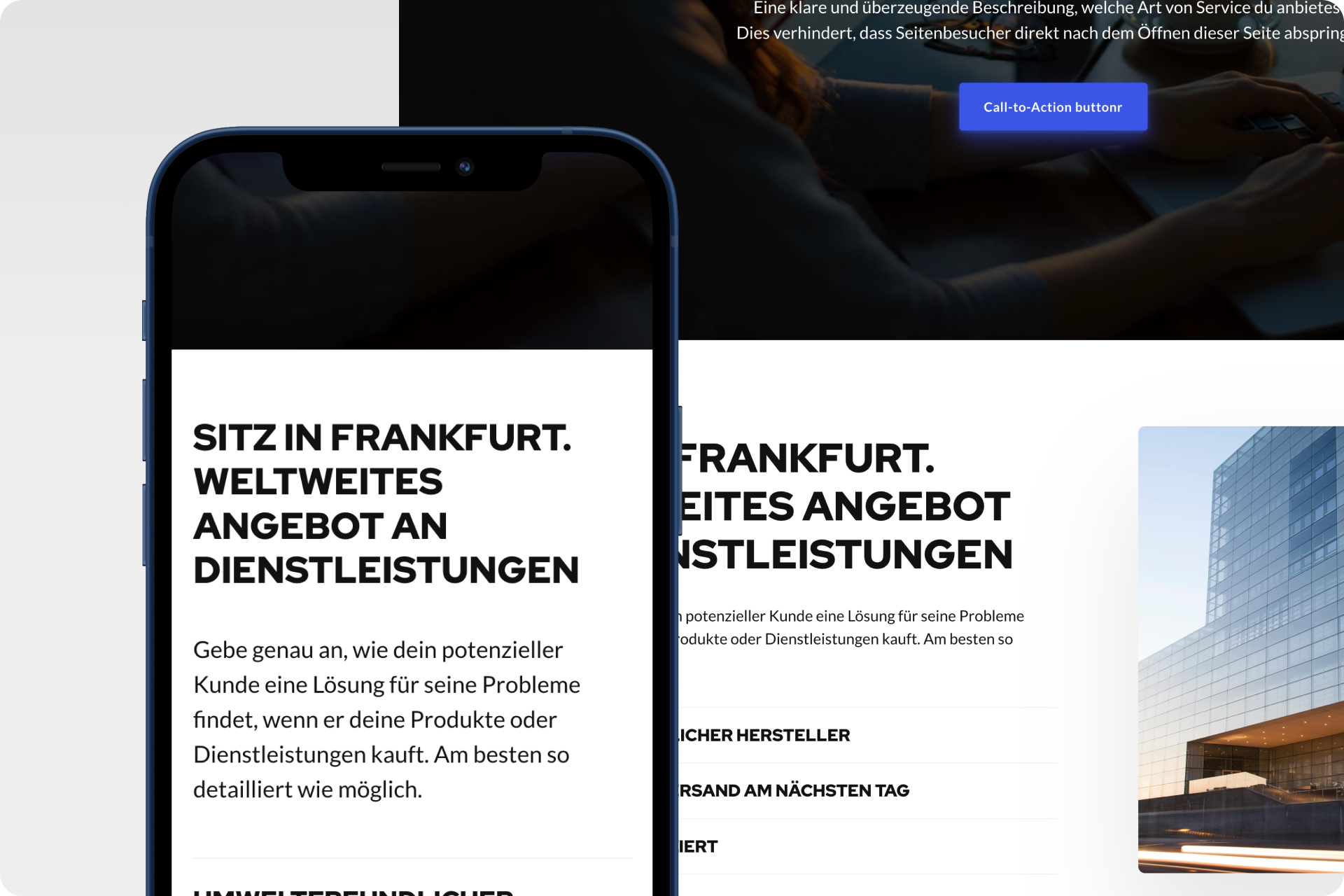
In today's mobile world, responsive design is an absolute must. Ensure that your website is optimally displayed on various devices, such as smartphones and tablets. Responsive design guarantees a user-friendly experience and keeps visitors on your website for longer.
Do's:
- Regularly test the display of your website on different devices to ensure it functions well on all screen sizes.
- Use flexible layouts and images that automatically adapt to the screen size, ensuring an optimal user experience.
Don'ts:
- Avoid using rigid layouts that are unreadable or unusable on mobile devices.
- Don't overlook the importance of loading speed on mobile devices. Optimize your website to ensure fast loading times and avoid frustrating visitors.
How to apply it in practice
Let's say you run an online fashion store and want to ensure your website is displayed optimally on all devices.
A practical example of responsive design is when a user visits your online store website using their smartphone. The layout automatically adjusts to the smaller screen size. Navigation becomes a convenient menu icon that can be expanded with a single click. Images are loaded in an optimized size to reduce loading time. Text is legible, and it's easy to add products to the cart or access more information.
By implementing these do's and don'ts, you can ensure that your website provides a user-friendly experience on all devices. By applying responsive design, you reach a wider audience and ensure that visitors stay on your website longer, spending more time exploring your offerings.
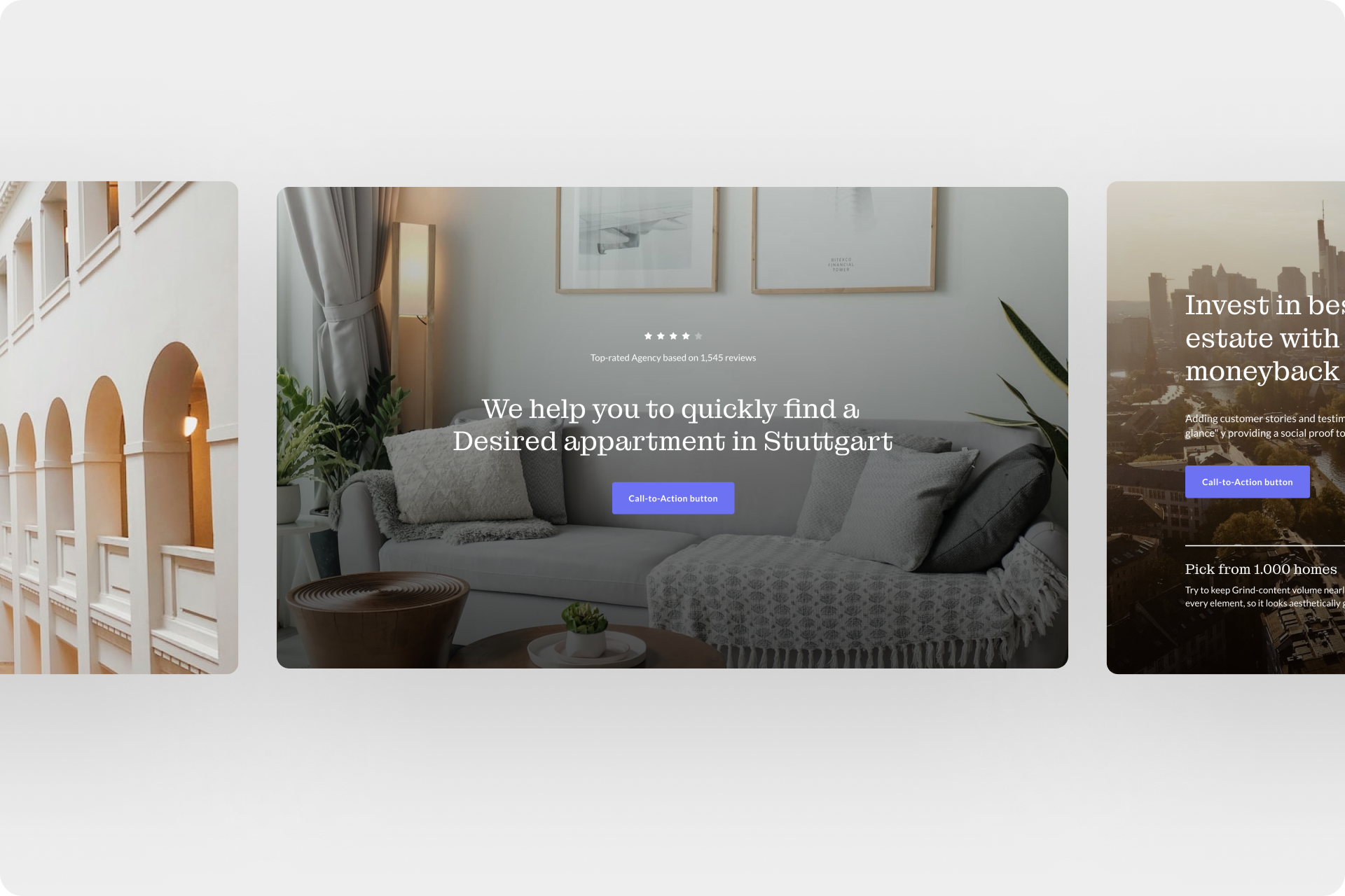
#Color scheme and typography
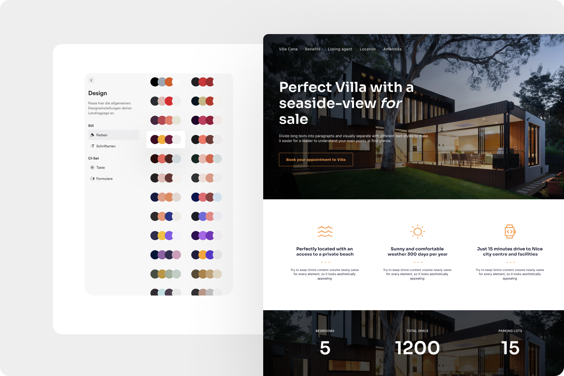
The choice of colors and fonts can have a significant impact on the effectiveness of your website. Select colors that align with the personality and purpose of your website. Ensure that the font is legible and provides a pleasant reading experience. Consistency in typography and color scheme gives your website a professional appearance.
Do's:
- Choose a color palette that aligns with your brand identity or website. Consider the style, target audience, and type of content you're presenting. Use colors that harmonize with each other and create a pleasant overall visual.
- Pay attention to good readability of fonts. Use clear and legible fonts for the body text of your website. Emphasize important headings or titles with an appropriate yet still readable font that grabs attention.
Don'ts:
- Avoid using overly bright or high-contrast color combinations that may impair readability or strain visitors' eyes. Ensure that the background and text have sufficient contrast for clear readability.
- Avoid excessive use of different fonts. Too much variety can appear unprofessional and hinder readability. Limit yourself to a maximum of two or three fonts that complement each other well and create a consistent visual appearance.
Practical Example:
Let's say you want to create a website for a travel blog. You want the color scheme and typography to reflect the sense of adventure and enhance the readability of your content. Here are some examples of how you can achieve this:
- Choose a color palette that resonates with nature and outdoor experiences, such as earthy tones like green, brown, and blue. Use these colors for headings, links, or highlights to accentuate important elements.
- Use a clear and legible font for the body text, such as "Roboto" or "Open Sans." Highlight headings with a more eye-catching font that conveys adventure and excitement, such as "Montserrat" or "Bebas Neue."
Tip: Also, read our article "How to write convincing website copy" and learn how to write conversion-focused website texts.
#High-Quality images and graphics
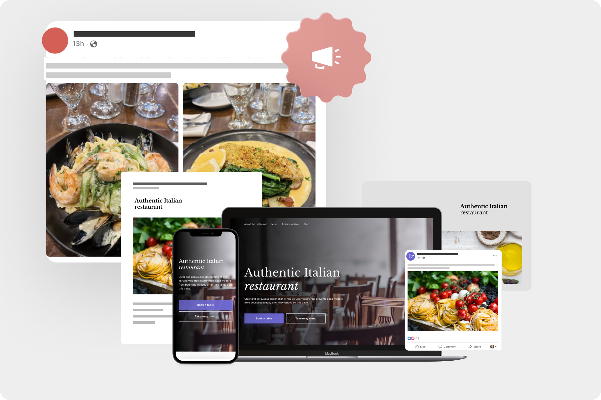
Images and graphics are crucial for good website design. Use high-quality, appealing images that align with the message of your website. Pay attention to the optimal size of the images so that they can load quickly without slowing down your website. Utilize graphics and visual elements to support your content and attract attention.
Do's:
- Use high-quality images that look professional and align with the message and mood of your website. Invest in licensed images or create your own to establish a unique visual identity.
Don'ts:
- Avoid blurry or pixelated images that could undermine the professionalism of your website. Don't use low-resolution or too small dimension images that appear pixelated on large screens.
- Don't overload your website with too many images and graphics. Ensure they are strategically placed and provide added value to the content. Too many visual elements can distract attention, negatively impact loading time, and not optimize your website design effectively.
Practical Example:
Let's say you have a website for a restaurant and you want to use high-quality images and graphics to engage visitors and stimulate their appetite. Here are some practical examples of how you can achieve this for a great website design:
- Use professional photos of your dishes that look appetizing and appealing. Ensure that the images reflect the quality and taste of your cuisine.
- Utilize graphic elements such as icons or illustrations to highlight important information or provide visual instructions, such as for reservations or special offers.
- Avoid low-resolution images that might appear blurry or pixelated. They could give the impression that your dishes are of inferior quality.
- Don't overload your website with too many images of each dish. Instead, carefully select a few to emphasize the attractiveness and clarity of each individual dish.
By following these do's and don'ts, you can leverage high-quality images and graphics to enhance the visual appeal and success of your website design. Images and graphics are effective means to evoke emotions, convey information, and capture visitors' interest.
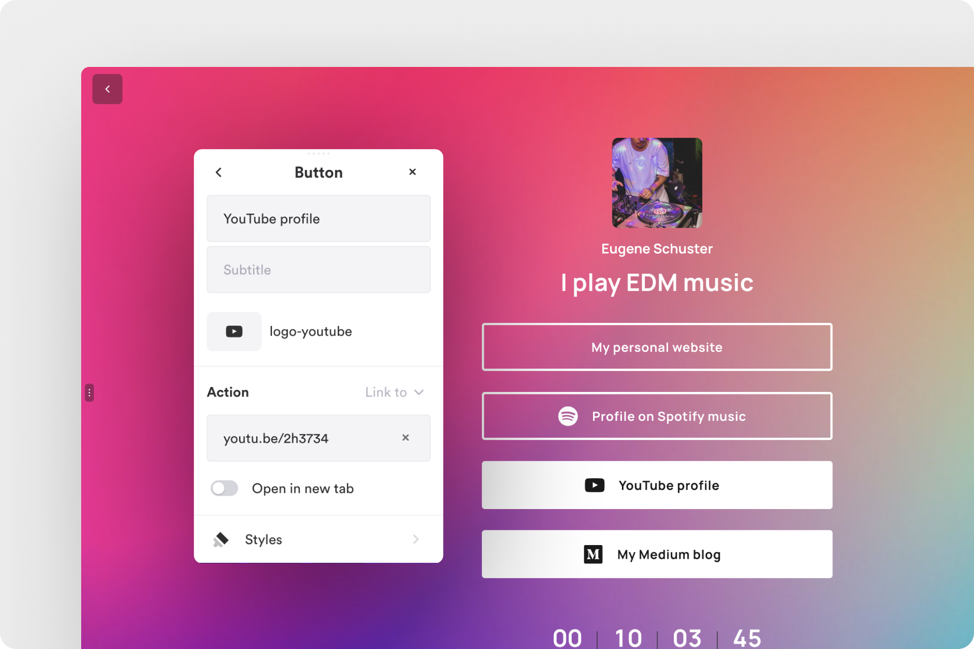
#Call-to-action (CTA)
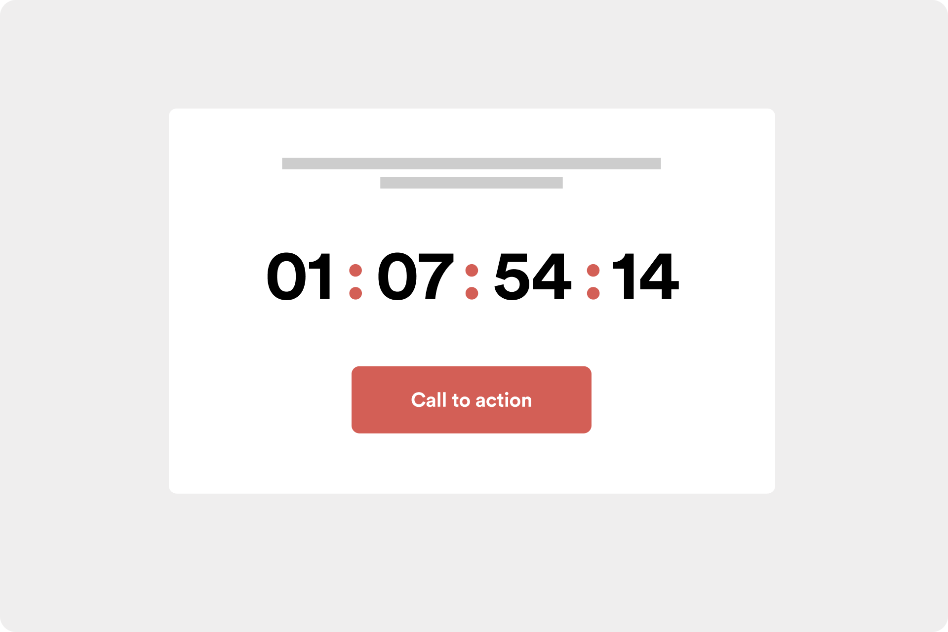
Integrate clear call-to-action elements into your website design. Place buttons or links strategically to encourage visitors to take action, whether it's purchasing a product, signing up for a newsletter, or contacting you. A clear call-to-action leads to a higher conversion rate and helps you achieve your goals.
Do's:
- Use eye-catching and well-placed call-to-action buttons that grab visitors' attention. Use contrasting colors and clear labeling that directly guide users to the desired action.
- Ensure that the call-to-action elements are clearly worded and prompt users to act immediately. Use active verbs and concise language to highlight the benefits of taking the action.
Don'ts:
- Avoid excessive use of call-to-action elements that overwhelm or confuse users. Place them strategically and in relevant locations to ensure a clear and focused user experience.
- Don't use unclear or vague calls to action that leave users unsure about what to do. Provide clear and explicit communication so that visitors know what action is expected of them.
Practical Example:
Let's say you want to encourage visitors to sign up for your fitness class. Here are some practical examples of how you can effectively use call-to-action elements:
- Place a prominent and attention-grabbing "Sign up Now" button on the homepage and class pages. Use a striking color that stands out from the rest of the design and add a brief text that emphasizes the benefits of signing up, such as "Achieve your fitness goals today!"
- Integrate call-to-action links or buttons into informative blog articles or testimonial pages to encourage visitors to get more information or contact you directly.
- Avoid using unclear or generic calls to action like "Click Here" or "Learn More" that don't clearly indicate what the user can expect. Be specific and clear to promote the desired actions, such as "Join Now" or "Schedule a Free Trial Class."
By following these do's and don'ts, you can integrate effective call-to-action elements into your website design to increase the conversion rate and guide visitors towards desired actions. A clear call-to-action is crucial for converting visitors into customers or prospects and achieving your goals.
Note: Also, read our blog article "Build your own landing page in just 5 steps" to learn how to create an optimal structure for your landing page.
#Optimize loading times
A slow website can frustrate visitors and cause them to bounce. Optimize the loading times of your website by reducing image sizes, minimizing the use of scripts, and implementing caching techniques. A fast website not only improves user experience but also has a positive impact on your search engine ranking and website design.
Do's:
- Reduce the size of your images by compressing them without compromising visual quality. Use efficient image formats like JPEG or WebP and optimize them for the web. This helps significantly improve loading times and your website design.
- Minimize the use of scripts and external files to reduce the number of server requests. Consolidate CSS and JavaScript files to shorten loading time. Also, utilize browser caching techniques to make repeated page visits faster.
Don'ts:
- Avoid using too many plugins or extensions that could slow down your website. Regularly review which plugins are actually necessary and deactivate or remove unnecessary ones.
- Don't use overly large media files such as videos or audio files that can significantly impact the loading time of your website and its design. Optimize them for the web and choose the appropriate file format and compression.
#Regular maintenance
A successful website requires regular updates and maintenance. Ensure that all information on your website is current and accurate. Regularly check for broken links, update content, and ensure smooth functionality. A well-maintained and up-to-date website design shows visitors that you care about your online presence.
Do's:
- Regularly update your content to ensure it is relevant and up-to-date. Outdated information can confuse visitors and undermine their trust in your website.
- Perform regular checks for broken links and fix them immediately. Broken links can lead to a frustrating user experience and impact your website's ranking in search engines.
Don'ts:
- Avoid outdated design elements or layouts that are no longer modern. An outdated appearance can give the impression that your website is neglected and lacks value.
- Do not neglect website maintenance, including regular updates of the CMS (Content Management System) and plugins. Outdated software can have security vulnerabilities and jeopardize the stability and functionality of your website.
Note: Also, read our article "Landing page pptimization: 8 Steps to better conversion" and learn how to optimize your landing page in just 8 steps.
Practical Example:
Let's say you run an e-commerce shop selling electronic devices. To ensure a successful website design, it is important to regularly perform updates and maintenance tasks.
- Update the product information and prices on your website to ensure they are correct and up-to-date. Outdated information can lead to confusion among visitors and undermine trust in your brand.
- Regularly check for broken links, especially on product pages and the shopping cart. A smooth checkout process is crucial for maximizing the conversion rate and not losing potential customers.
- Avoid using outdated product images or descriptions. Ensure that the visual representations and information about the products are always up to date to provide an accurate representation of the products offered.
- Don't neglect the regular update of your e-commerce platform and plugins. Security updates and bug fixes are important to maintain the integrity of your online shop and protect it from potential security risks.
By following the do's and avoiding the don'ts, you can ensure that your website is always current and well-maintained. This helps strengthen visitor trust, improve user experience, and secure long-term success for your website.
#Keeping user orientation in focus
The primary element of effective website design is user orientation. Ensure that your website fulfills the needs and expectations of your target audience. Place essential information prominently, provide helpful features, and facilitate seamless user interaction. By designing your website with the user in mind, you can create a positive user experience that encourages visitors to return.
Conduct thorough research to gain a better understanding of your target audience's needs, expectations, and behaviors. This can be accomplished through surveys, interviews, or the analysis of user data. Utilize these insights to customize your website's design according to the preferences of your target audience.
Conclusion
A successful website design is crucial in attracting, engaging, and ultimately converting visitors. In this guide, we have covered important tips for creating a successful website design that can help you establish an impressive online presence. From the clarity and simplicity of the design to the use of high-quality images and graphics, as well as optimizing loading times and prioritizing user orientation, all of these aspects play a vital role.
Achieving a successful website design requires dedication, attention to detail, and continuous adjustments. By putting these tips into practice, you can elevate your website to a new level and inspire visitors to stay, interact, and ultimately convert. Always remember that a good website design is an investment in the success of your online presence.
Why not try it out for yourself and create your first website with Onepage? With our software, you can easily, quickly, and, most importantly, for free, create your own website, landing page, funnel, or link tree. Simply follow the link to sign up and perhaps even publish your first website today! Follow the link to sign up and maybe even publish your first website today!
Start with
Onepage for free.
It’s fast and enjoyable
Onepage is free to use. It’s not a trial version.
No credit card is required


