June 20, 2022
How to make your LP design a success - avoid these 20 design fails
Using 20 examples, we show you the most important "do's" and "don'ts" for your landing page design
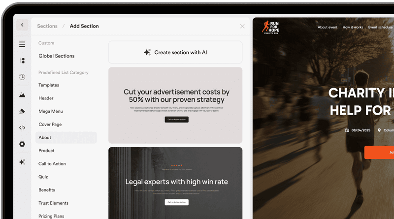
Many people from the DACH region create websites, landing pages, quizzes, and funnels on Onepage. We took a close look and analyzed what are the most common design fails when creating a page on our software. Here you will find a clear list of "do's" and "don'ts" for an optimal landing page design, which apply not only to Onepage but also to any other landing page software.
How to make your LP design a success - avoid these 20 design fails
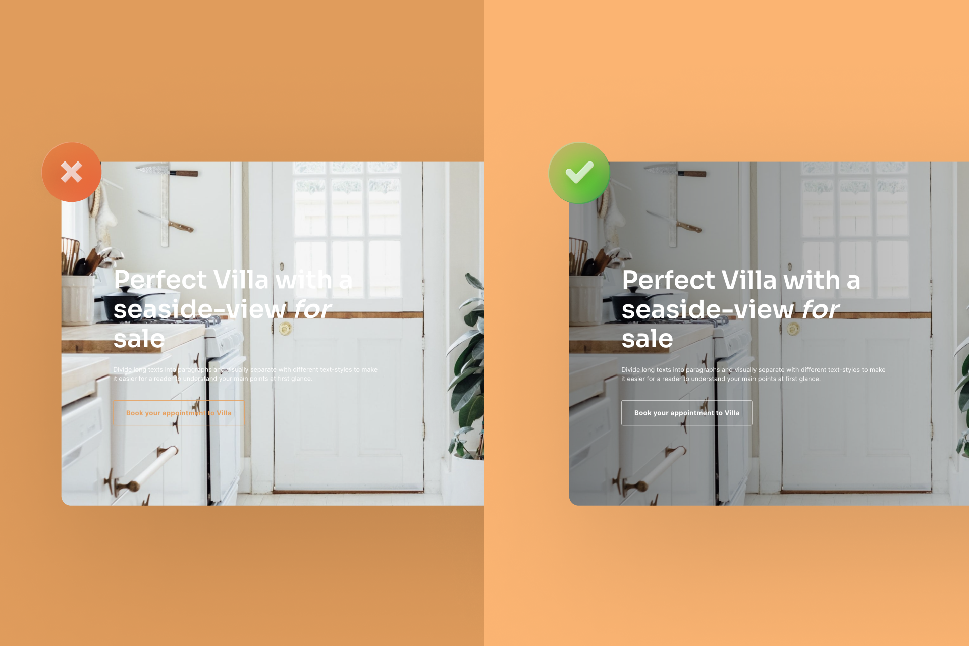
1. Position the elements in the first section in the right relation to each other
In order for your site visitors to have the best possible experience, your landing page design should create a harmonious overall look. To do that, you should avoid certain design fails. You want to use a background photo? Then avoid overlapping. Again, if you have a dark background, opt for a light font.
2. Too many full images in one row
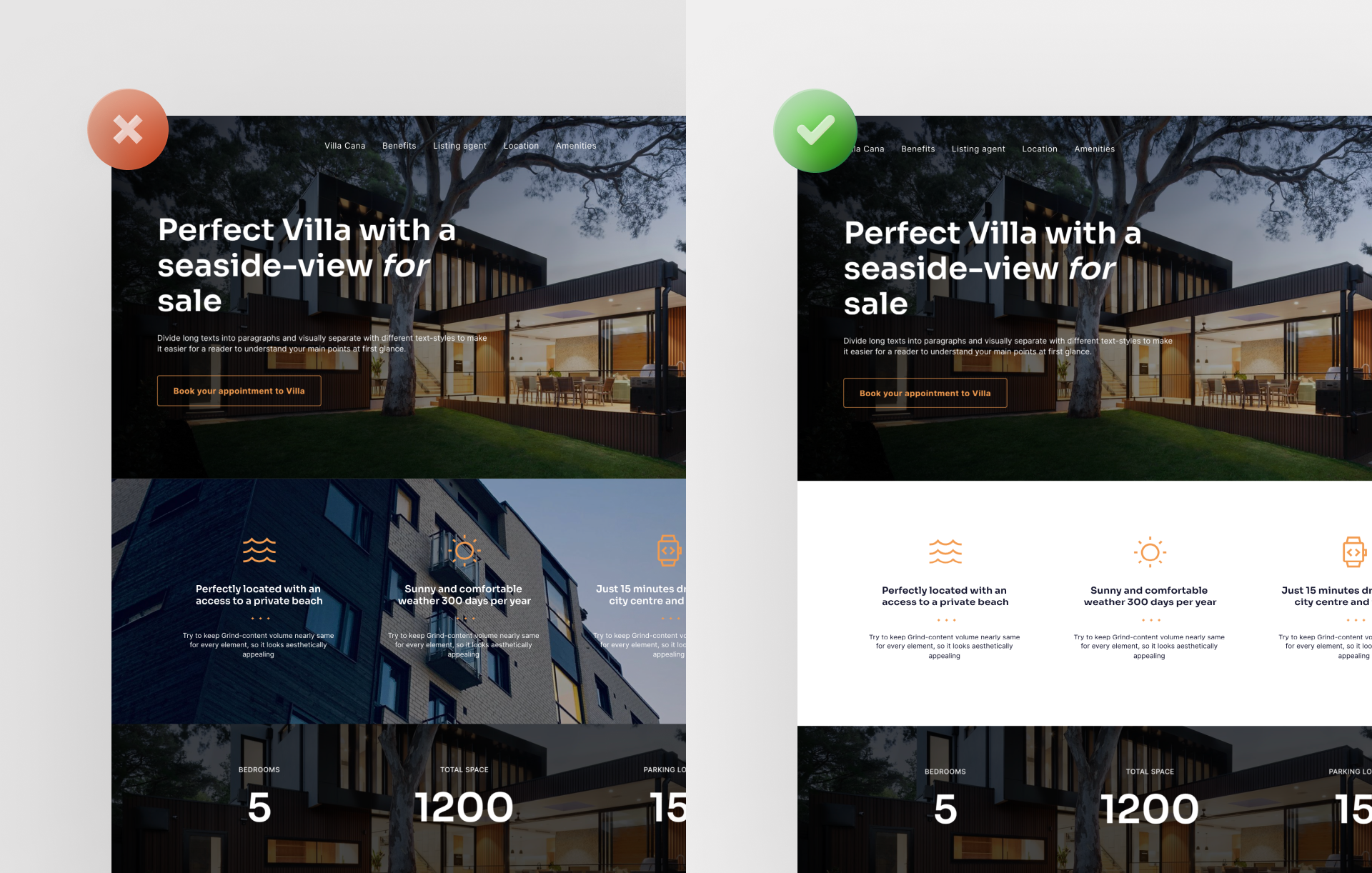
Images are important elements that you should use on your site. However, if you place them incorrectly on your landing page, they can quickly become overwhelming (this is especially true for full images). That, of course, would definitely be a design fail. Instead of lining up several full images, place a white section between them, for example.
3. Too little contrast in text passages on an image
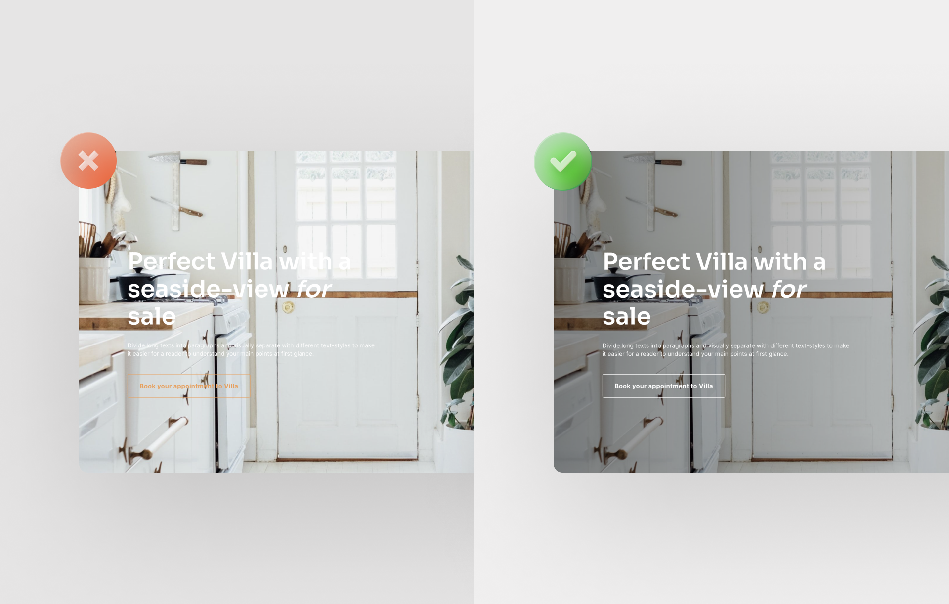
For a successful landing page design, you should ensure sufficient contrast between the text and the background image. To achieve this, you can apply an appropriate filter over the image. In Onepage, you can achieve this effect by using the "overlay function". Alternatively, you can choose an image that offers enough contrast right from the start.
4. Decide on one style and keep it throughout your landing page design
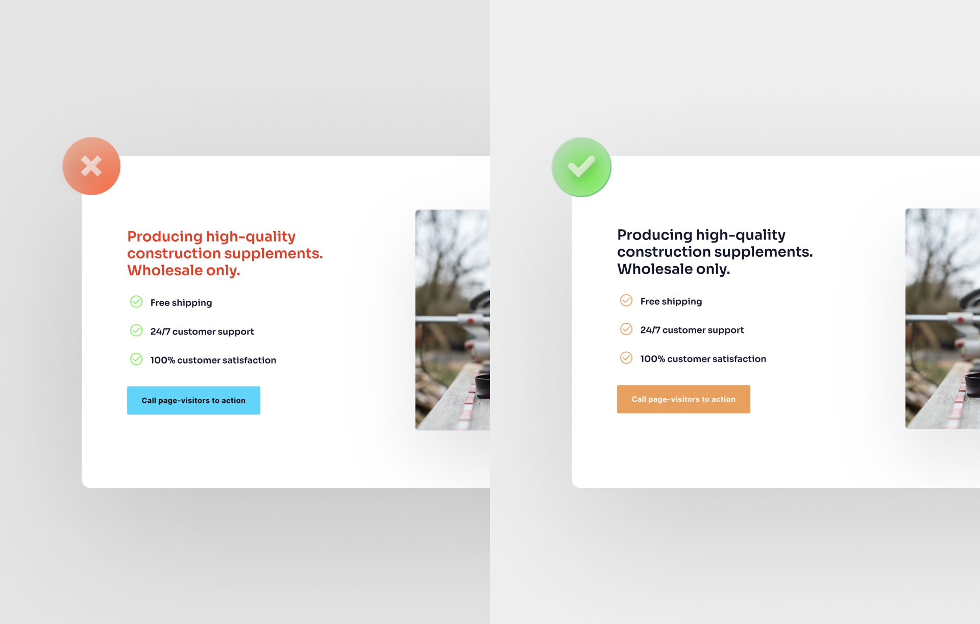
Too many design styles used on one page will make your page look cluttered. Therefore, you should avoid this design fail and choose only one font and one related color group.
Want to learn more about how to build a great landing page? Then check out our blog article on how to build your own landing page in just 5 steps.
5. Too much text in one paragraph
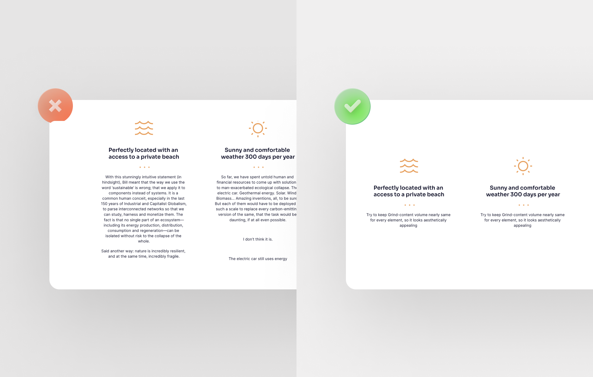
If there's too much text in a narrow section, it's hard for your site's visitor to read. Besides the design aspect of your landing page design not being aesthetically pleasing, too much information at once overwhelms the page visitor. Therefore, it makes sense to reduce the text. Otherwise, there is a risk that it will not be read.
6. Too much centered text
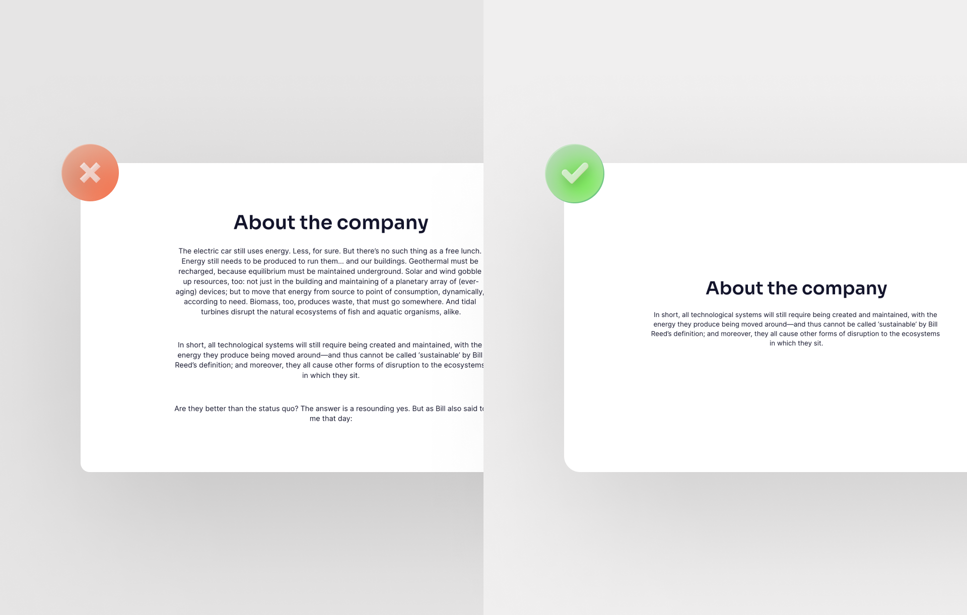
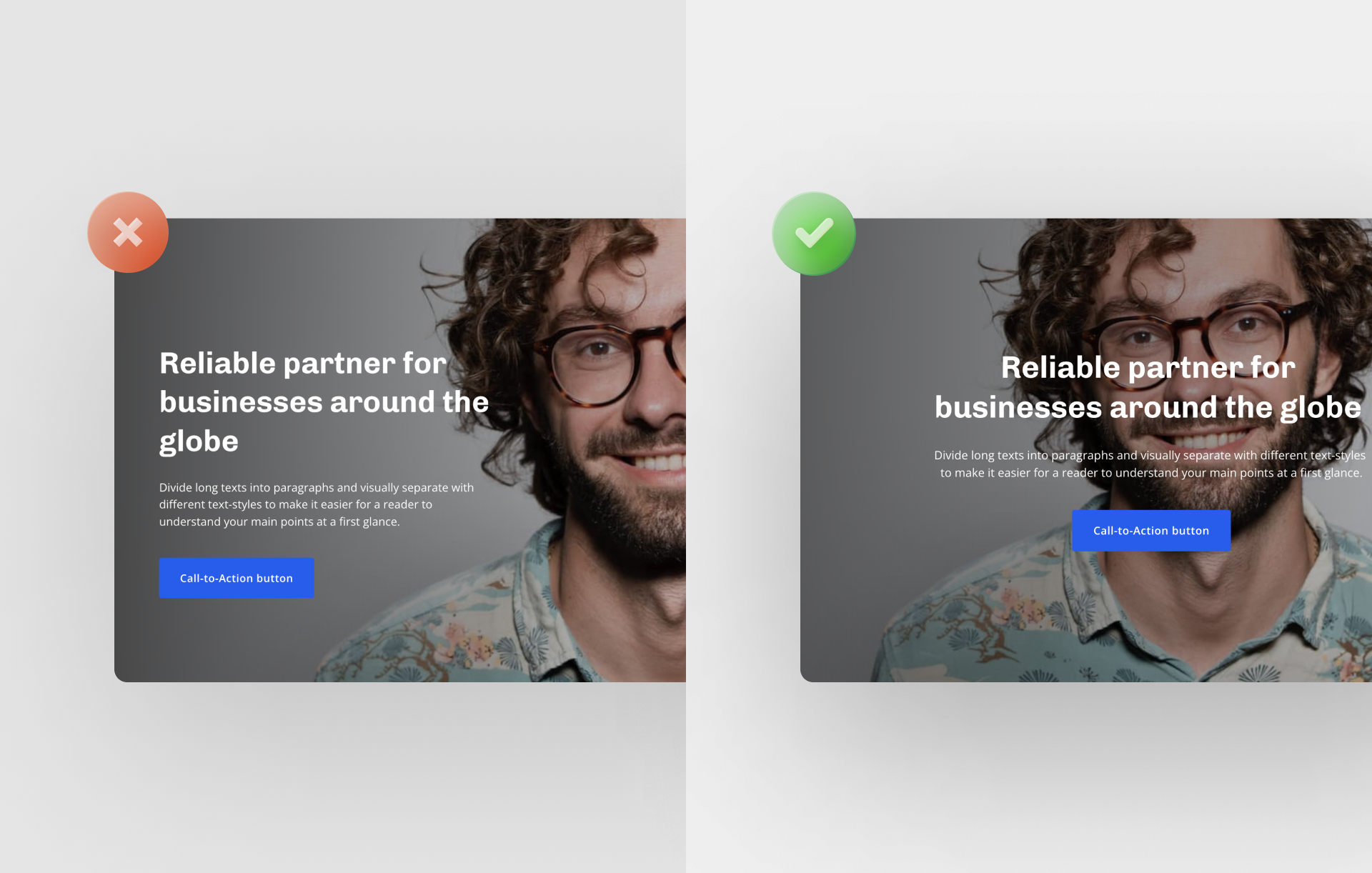
As long as it's short sections of text, centering a text makes sense for your landing page design. However, if you have more centered text, it will be difficult for the visitor to read it. For longer sections of text, you can then align the text flush left, for example.
7. Too many input fields in the form
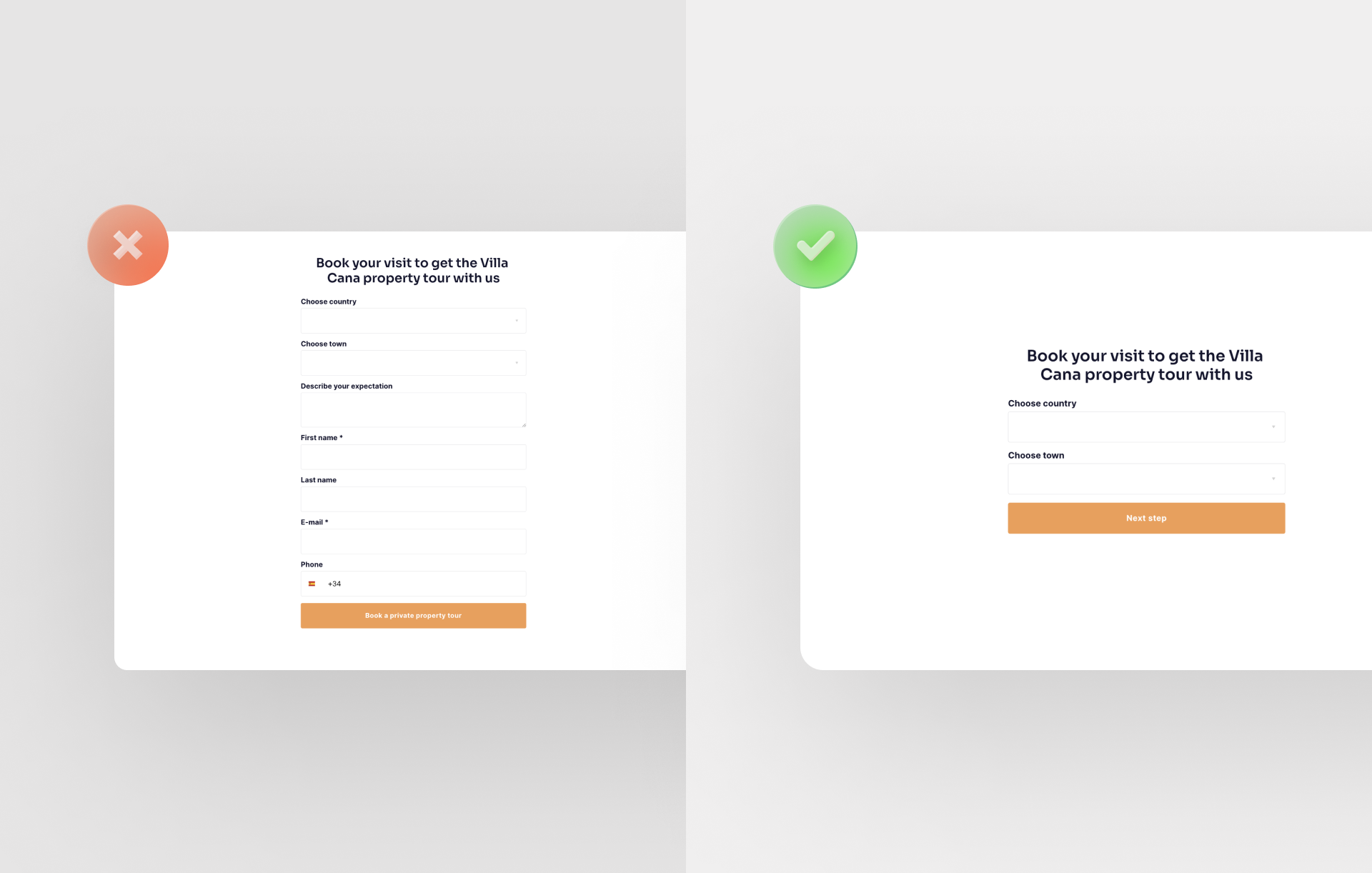
The number of form fields is a tool for you to influence your conversion rate. It is a huge design fail to use too many fields. It can "overload " your landing page design. First name/last name, phone, and email should usually be enough.
8. Big design fail: A headline that is too small
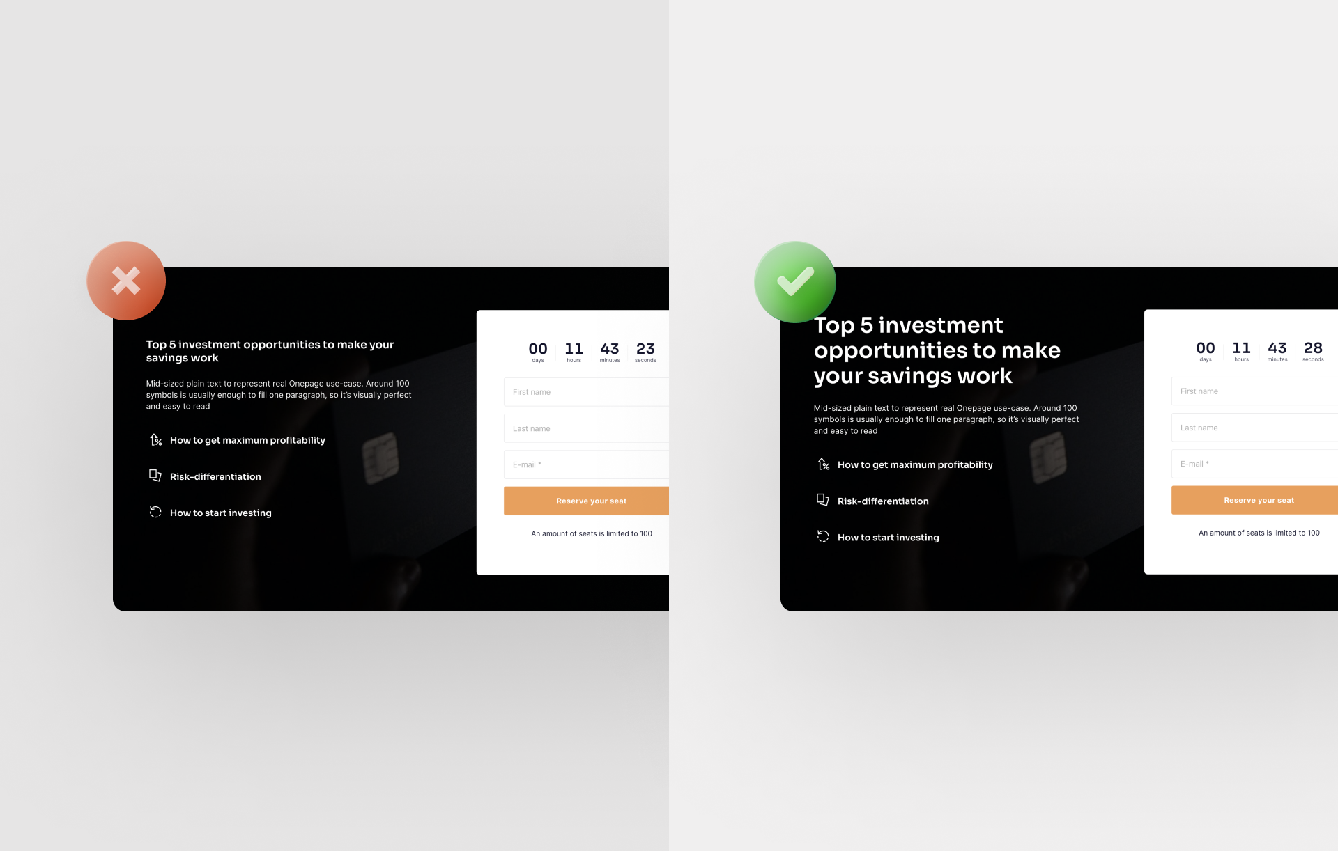
For a good landing page design, your headline should be easy to read. Therefore, decide on an appropriately large font size. This is especially true if the headline is short. If the headline is longer, you should use a smaller font size. This makes it easier to read, and you can easily add more design elements.
9. Wrong size of CTA buttons
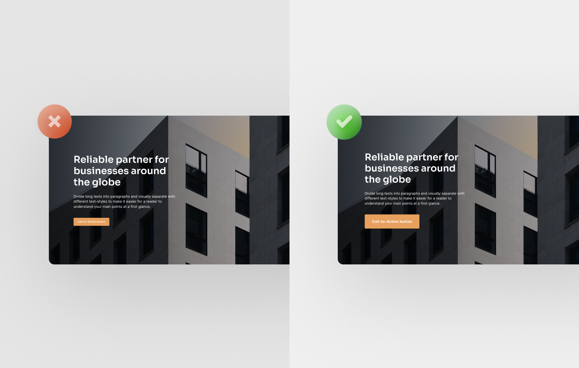
The call-to-action button is a major contributor to the success of your landing page. If you make it too small, it might get lost in the rest of the landing page design. It's best to use a size that's easy to read and attracts enough attention.
10. Disregarding the visual hierarchy
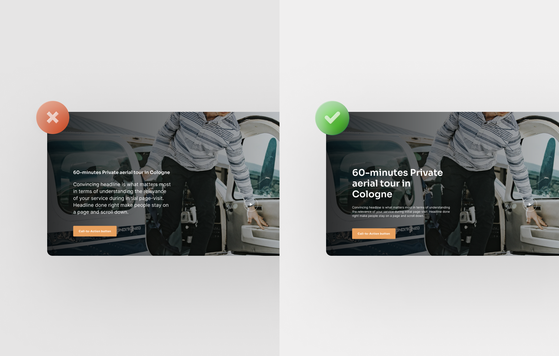
In order for your site visitor to be able to orientate themselves as quickly as possible and filter the information for themselves, a certain design hierarchy should be adhered to in your landing page design. This means that the headline is the largest design element and should be larger than the rest of the text. If necessary, this should be followed by a slightly smaller subheading and then the body text in an even smaller font size. This is exactly the order that will work for your landing page design.
11. Big design fail: Excessively long and wordy text
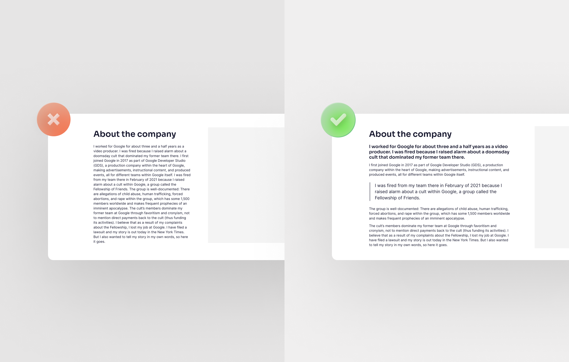
Too much information often hinders rather than helps the reader. Therefore, limit your text to the essential points and keep it as short and informative as possible. Longer texts should be divided into logically structured sections. Avoid this design fail and refrain from overly long and wordy texts.
For more insider tips on "How to write convincing landing page copy?" check out this blog article.
12. Different spacing between text blocks
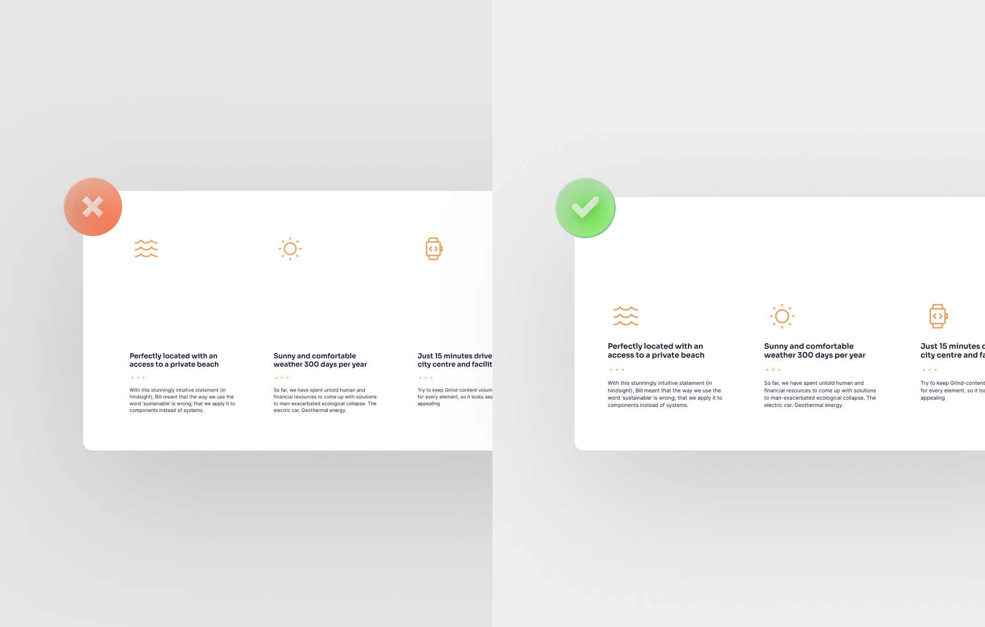
If text blocks have the same content weighting, they should also be spaced equally.
For example, if the spacing between the headline and an author's image is too small, it will look like the author is more involved with the headline than the text that follows. Therefore, for an optimal landing page design, you should choose the right spacing.
13. Too little space between image and text
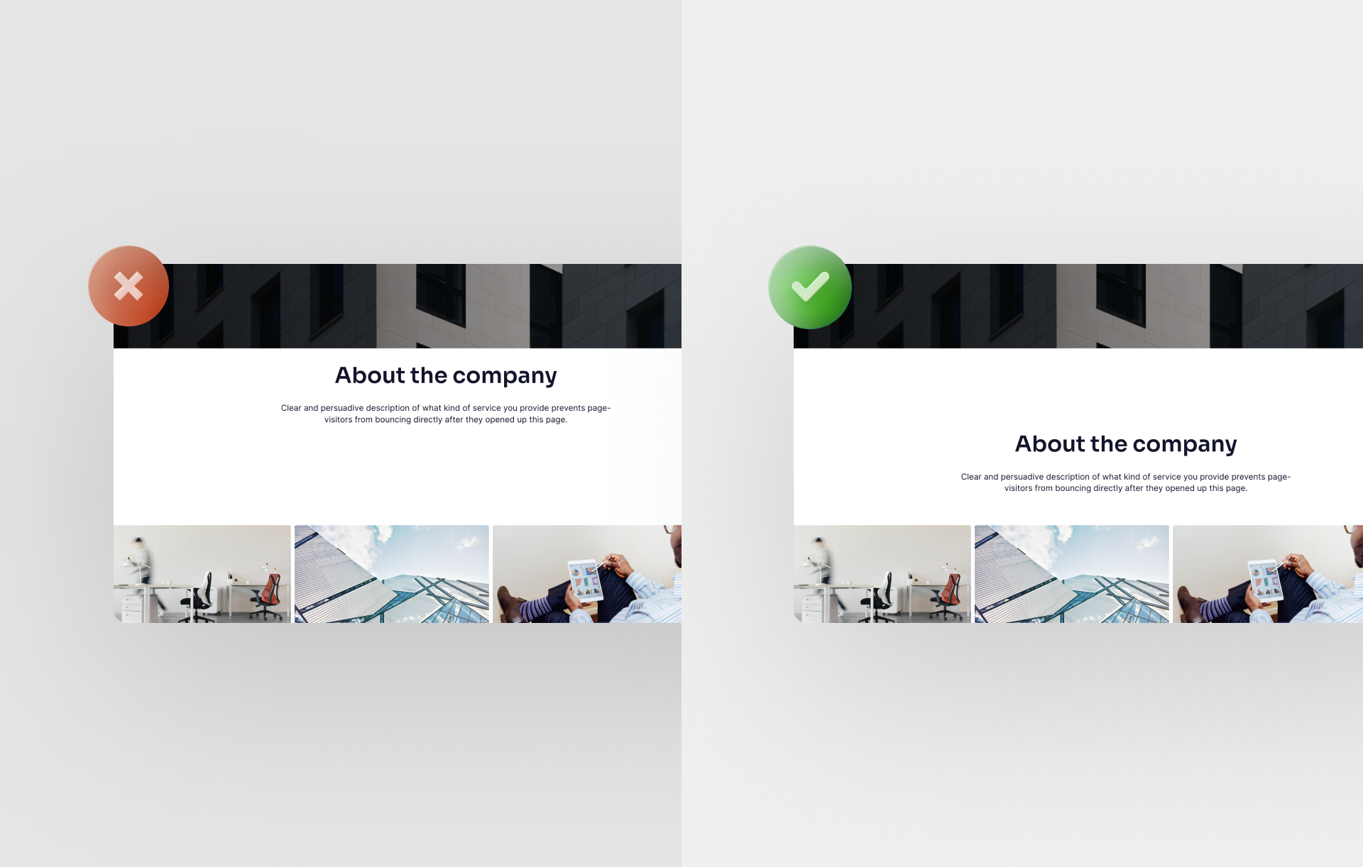
For a great landing page design, the spacing between image and text passages should be the right size. Too little space between image and text can quickly become "constricting". Therefore, make sure there is enough space between these elements and avoid this design fail.
14. Uniform text alignment for a great landing page design
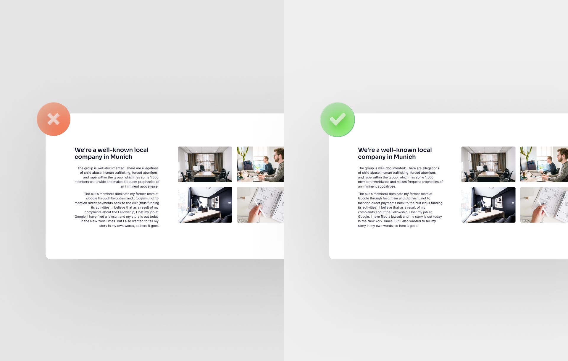
The human eye likes symmetry. Therefore, make sure that text passages have the same text alignment.
15. Too small icons
Icons are great design elements. Therefore, give them an appropriate size. They should be easily recognizable by the visitor and visually fit into the overall picture of your landing page design.
16. Omit visual content from your landing page design
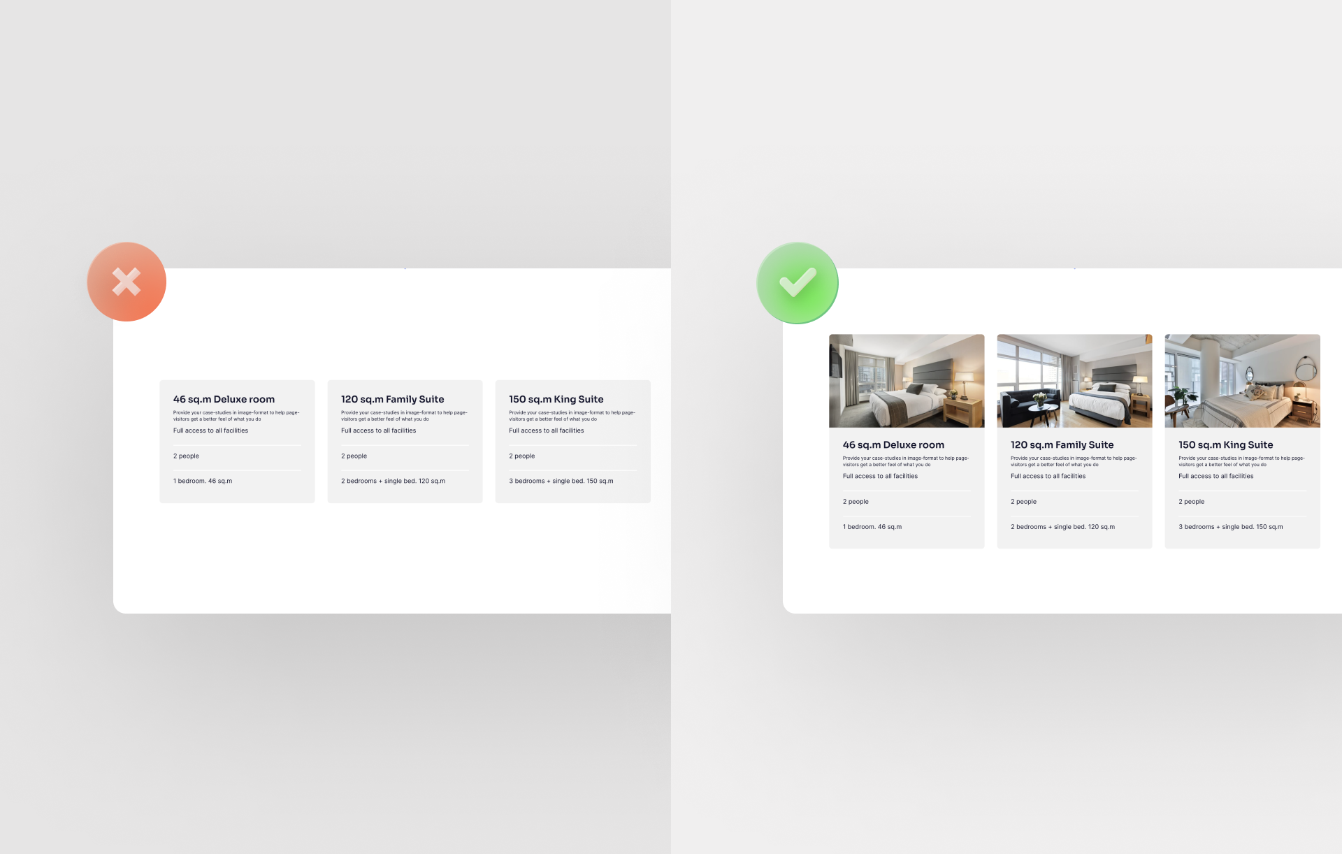
Besides great texts, your landing page design also needs visual content in the form of images or videos. Images and videos reinforce the content statements and can better convey emotions. Without visual content, your page can quickly look monotonous and cluttered.
Make sure to check out our blog post on "10 rules for digital storytelling".
17. Create individual sections too small
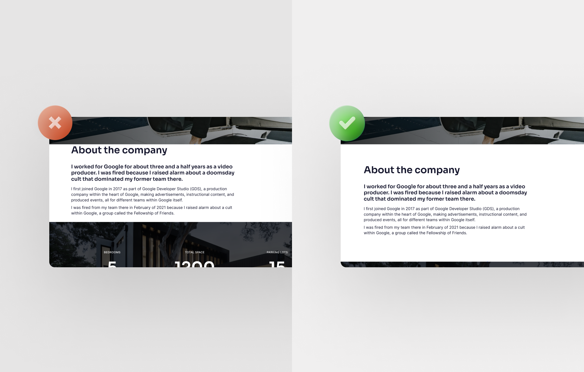
In a great landing page design, each section should be large enough in size. Sections that are too small are a big design fail because it makes your landing page design look unprofessional. Therefore, you should make sure that each section is about the same size.
18. Enormous design fail: Make the CtA button too discreet.
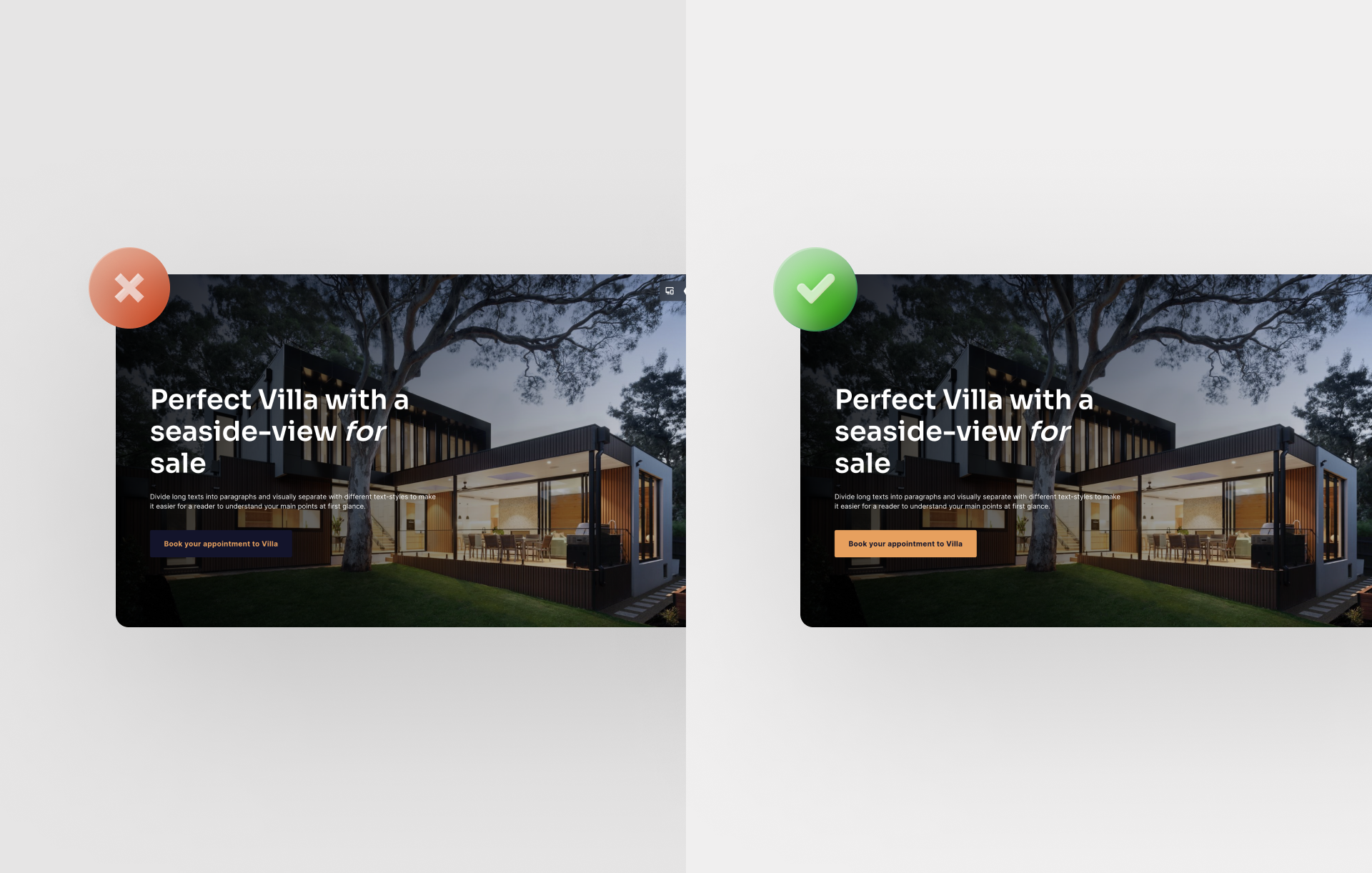
The CtA button significantly contributes to the success of your landing page. Therefore, its design should match the rest of your page, and it should not simply disappear in the background due to a too inconspicuous color.
19. Too little space between the headline and the body
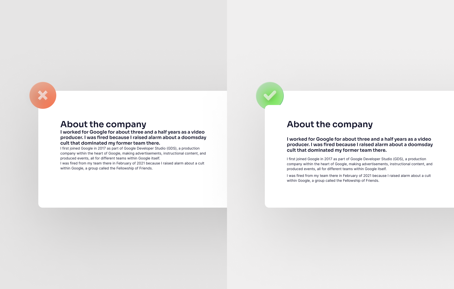
To guarantee a consistent landing page design, the distance between the headline and the follow-up text should be sufficiently large. This allows the reader to divide the content into logical paragraphs.
20. Using too many dividers on one page
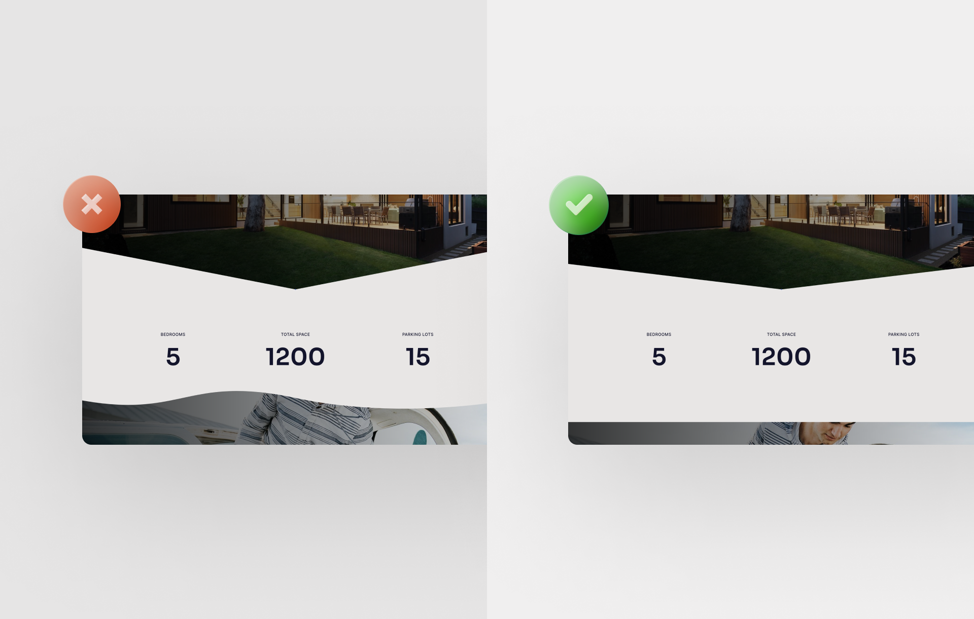
A well-used divider makes your landing page design look premium. However, if too many dividers are used on a page, the exact opposite will happen. In particular, this is true if the dividers follow each other directly or even if different divider elements are used. Avoid this design fail at all costs.
If you want to follow our tips 1:1, make sure to quickly register your Onepage account now.
Since recently, we offer you a FREE account, so you can work with it directly and implement our tips. Build a landing page today and generate more customers and sales for your business.
Start with
Onepage for free.
It’s fast and enjoyable
Onepage is free to use. It’s not a trial version.
No credit card is required

